Visualising US Voting Records with shinydashboard
Dec 27, 2017 · 1813 words · 9 minutes read
Introducing adavis
My second ever post on this blog was on introducing adamap, a Shiny app that maps Americans for Democratic Action voting scores (the so-called Liberal Quotient) between 1947-2015. It was built with highcharter, and hence it was nicely interactive but quite slow. I wanted to switch to another package since, and when I eventually ran into statebins, I knew what had to be done.
I was certain that statebins would definitely add some oomph to the design, but because it’s so easy to implement, I had some spare time to do other things. As it is often the case, one thing led to the other, and I came to the conclusion that the revamped app should feature one plot from every major graphics package. Of course, a strict implementation of that statement would be quite difficult, so I downgraded the challenge to just four plots using a different package each time. I ended with statebins for state-level mapping, plotly for plotting changes from the previous year, ggExtra for head-to-head state comparisons, and *drum roll* base R for graphing a single politican’s voting record over time. It turned out to be fun.
As I have already explained the data setup in my previous post linked above, I will skip to the visualisations. I won’t be including the actual code for the Shiny app, which includes reactive elements throughout. You can fork the code underlying the live dashboard on GitHub and/or run a local copy via the runGitHub code provided there. Also, none of the codes are evaluated here (as I translate them from the app), so they will not work if you just plug them in. Hence, there are primarily for motivation rather than replication.
Slicker US with Statebins
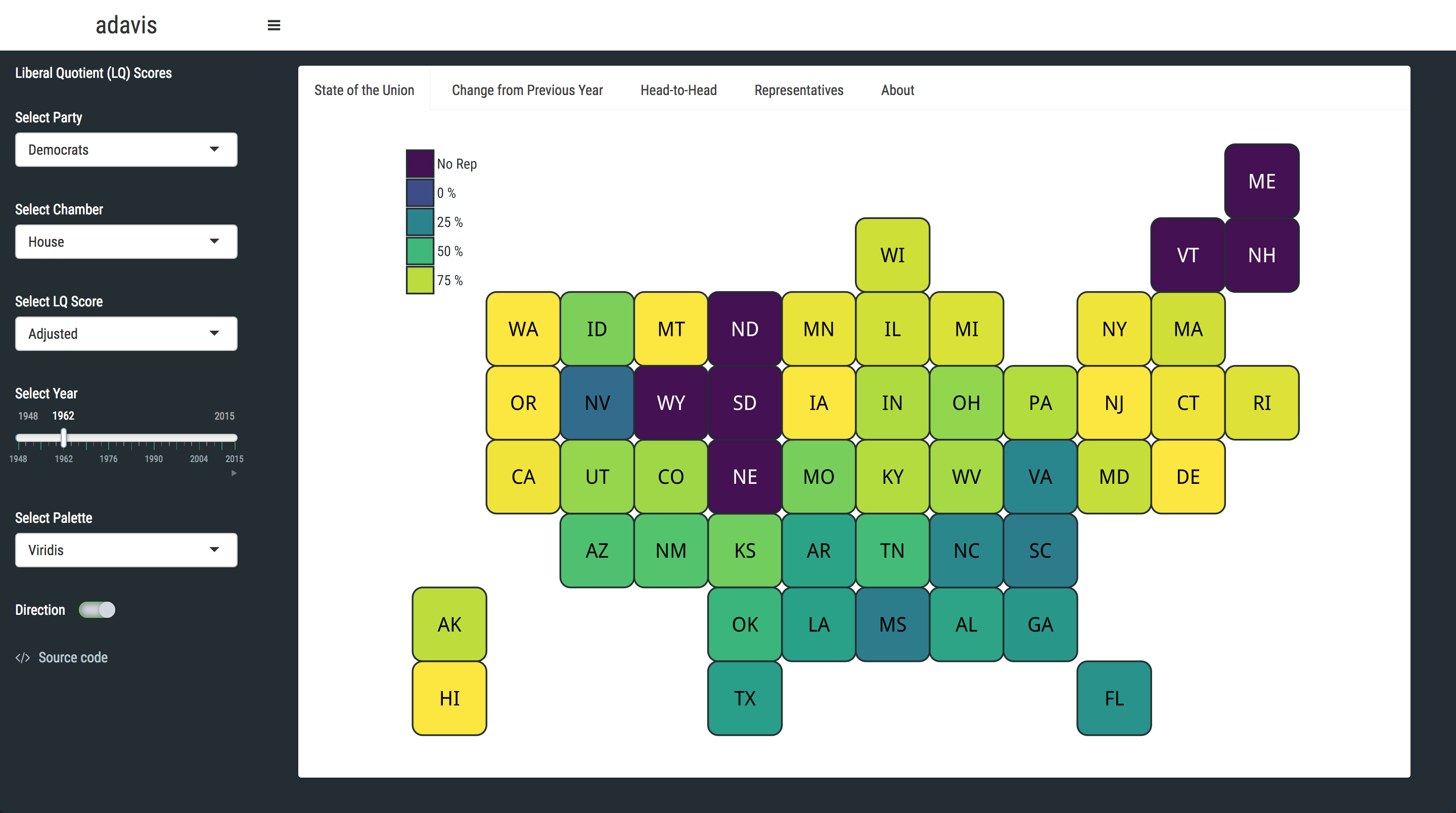
There are many good things about statebins. First, you get identical-sized states so you don’t get biased by the variation in their size. It’s cleaner by definition, not featuring idiosyncratic shapes that are found in nature. Also, it plays really nice with viridis, which is important (maybe). In addition, you can define light and dark labels for the state abbreviations, ensuring they will not blend into the fill colour. statebins can be called as a function (as I did), or applied later to a ggplot object. The only thing that did not work for me was the ggplot2_scale_function argument; R kept saying no such function is defined (I’m using the dev version from GitHub) so I ended up passing the fill colours separately. It gives a warning about overriding the existing fill, but works otherwise. If you download the dataset and want to visualise how House Democrats in 1962 voted, something along the lines of:
#Not evaluated
library(ggplot2)
library(viridis)
library(statebins)
library(hrbrthemes)
theme_set(theme_ipsum_rc())

#assumes data = data, year as "Year", state names in "State", voting scores in "ADA" etc.
us <- statebins(data[data$Year == 1962 & data$Chamber == 1 & data$Party == "Democrat", ],
                state_col = "State", value_col = "ADA",
                round = TRUE, font_size = 7, state_border_col = "#232d33",
                dark_label = "white",
                light_label = "black",
                state_border_size = .8, radius = grid::unit(10, "pt")) +
          labs(title = "") +
          theme(axis.text.x = element_blank(), axis.text.y = element_blank(), axis.ticks = element_blank(),
                panel.grid.minor = element_blank(), panel.grid.major = element_blank(),
                panel.background = element_rect(fill = "white", linetype = "blank"),
                legend.position = c(.075, .85),
                legend.text = element_text(colour = "#232d33", size = 14),
                legend.title = element_text(colour = "#232d33", size = 18),
                legend.key.height = grid::unit(.01, "snpc"),
                legend.key.width = grid::unit(.05, "snpc"),
                plot.margin = margin(-1, 0, 0, 0, "cm"))
    us + scale_fill_viridis(direction = -1,
         breaks = c(seq(-25, 100, 25)),
         labels = c("No Rep", paste(seq(0, 100, 25), "%  ")),
         guide = guide_legend(title = "", title.position = "top",
                              keywidth = 2, keyheight = 2, ncol = 1))
should do the trick. Now, I am totally cheating because the image is from the live app and the above code is not evaluated. However, it should give you an idea, mainly most of the clutter is about the layout rather than the content. Can we get someone with clout to ping Hadley and Bob regarding any updates on issue#4 from 2015 so we get magically created bins (and other shapes, for the ambitious) not just for US states but for everything?1 Cheers.
One trick regarding the data; the original data only have scores for selected representatives (naturally). Meaning, in any given year, there will be several states (approx. 8-10 per party) with no Democrat or Republican reps. As these are row-wise missing instead of NA, if you plot them as they are, those states will not show in the plot. If only there was a tidyverse function that would solve common data problems like this…
library(tidyverse)
#Add rows for missing states in party-year
#Use built-in states data
states <- data.frame(state.name, stringsAsFactors = FALSE)
states$state.no <- 1:50
dataset <- merge(dataset, states, by.x = "State", by.y = "state.name")
#I couldn't get this to work with strings so matched them by state.no
dataset <- dataset %>% tidyr::complete(state.no = full_seq(state.no, period = 1), Year, Chamber, Party,
                                       fill = list(ADA = -25, aADA = -25)) #Arbitrary low score instead of NA
dataset$State <- ifelse(is.na(dataset$State), states[dataset$state.no, 1], dataset$State)
Interactive Charts with Plotly
Moving on to challenge number #2, I wanted to keep to the same filter (Year > Chamber > Party), but with the amount of change from last year plotted instead. I haven’t used plotly much before so I learned on-the-go, but it has robust documentation if you are considering delving into it.
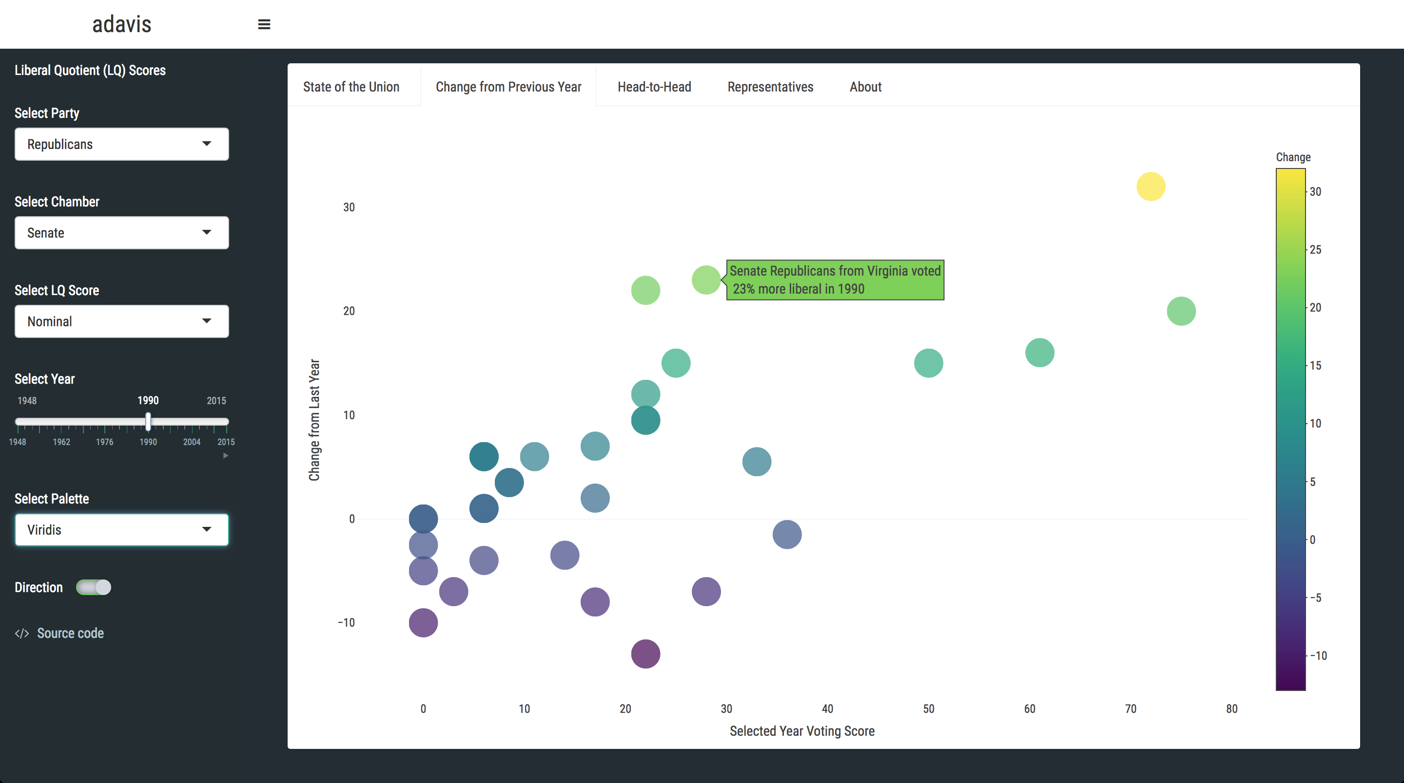
The main reason for going with plotly was its build-in interactivity. I wanted the users to just hover over points and see a block of text describing the shift from the previous year. This turned out to be easy, just with a somewhat ugly paste. One curious thing was the alpha functionality, which is governed with toRGB("colour", "alpha"), but called opacity in plotly. In the app, the default is showing Senate Republicans in 1990 (i.e. difference from 1989):
library(plotly)
#Store common args
ax <- list(
      showline = FALSE,
      showticklabels = TRUE,
      showgrid = FALSE)
#Mandatory data should be subsetted before comment
plot_ly(data, x = ~Score, key = data[, 1],
        y = ~Change, mode = "markers", type = "scatter", hoverinfo = "text",
        hoverlabel = list(font = list(family = "Roboto Condensed", size = 14)),
        #Add custom hover text
        text = ~paste(data$Chamber, data$Party, "from",
        State, "voted\n", paste0(abs(round(Change, 2)), "% more"), Label, "in", data$Year),
        color = ~Change, colors = viridis(direction = -1, n = 12),
        marker = list(size = 30, opacity = .7)) %>%
      layout(dragmode = "select", showlegend = FALSE,
        xaxis = c(ax, list(title = "Selected Year Voting Score", zeroline = FALSE)),
        yaxis = c(ax, list(title = "Change from Last Year", zeroline = TRUE, zerolinecolor = toRGB("black", .05))),
        font = list(family = "Roboto Condensed")) %>%
      config(displayModeBar = FALSE)
I admit today’s code chunks are a bit like this, so if you have any questions, just fire away.
’gram on the side with ggExtra
This whole project is basically me putting together various plotting techniques that I like but had yet to implement. The histograms-on-the-side style of the ggExtra package is definitely one of those. You can also have density plots (and box-plots) instead, which sounds like it could be more informative but IMHO it’s harder to read, especially without a baseline underneath. YMMV. The main function is ggMarginal, and you have to call it on an existing ggplot object - pretty straightforward.
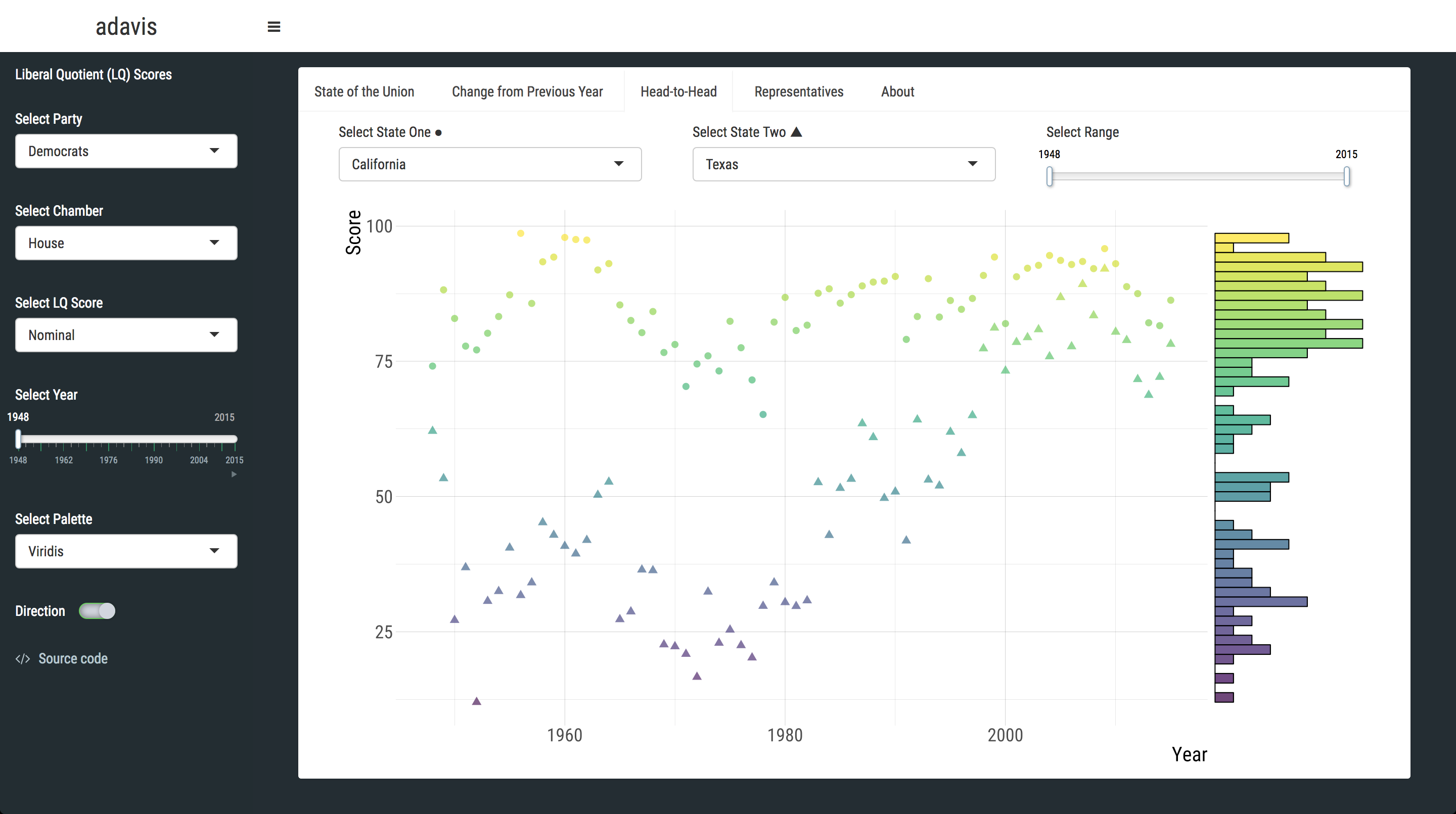
With this graph, I wanted to compare the historical record of two states (still operating under the Congress > Party subset). One could argue this could have been more informative if it included both parties; say how Democrats and Republican from NY voted in 2002. Perhaps, however that might introduce inconsistencies with the design, especially with the (almost) global slider options. The default plots House Democrats from California and Texas from 1948 to 2015, which shows a clear separation:
library(ggExtra)

#data should be a two-state subset
p <- ggplot(data, aes(Year, Score, color = Score)) +
         geom_point(aes(shape = State), size = 3, alpha = .7) +
         scale_color_viridis(direction = -1) +
         theme(legend.position = "none", axis.title.x = element_text(size = 20),
               axis.title.y = element_text(size = 20), axis.text = element_text(size = 18))

ggMarginal(p, type = "histogram", margins = "y", yparams = list(
           bins = 50, fill = viridis(n = 49, alpha = .8, direction = -1)))
Last but not least…Base R
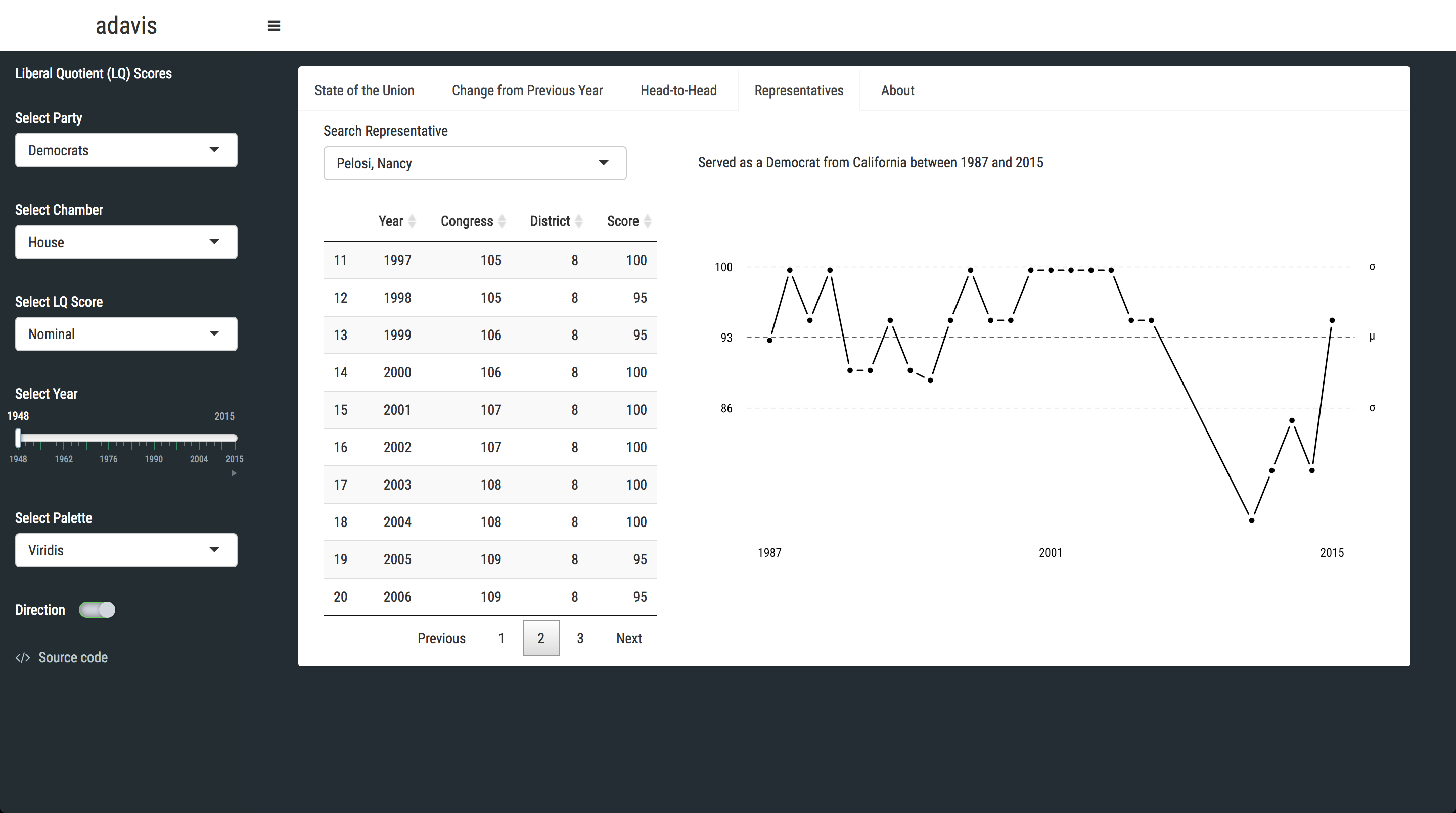
When I saw this brilliant post on Tufte, the plot I wanted to replicate the most was the very first one. The one that was done in base R. Some might even argue I added a representative look-up tab to the app just for trying this out. Hmm. Like plotly, I was out of practice with base R graphics, so I mimicked the original code as much as I could. One thing I wanted to convey with this graph is the consistency of a single politician over their tenure. I didn’t want to show minima and maxima, but just their mean score with some sort of confidence measure. I also learned that you can pass Greek letters with expression(), which is handy. Say, you want to plot the complete voting history of Nancy Pelosi:
#Store descriptives
v1 <- mean(data$Score)
v2 <- sd(data$Score)
v3 <- min(data$Year)
v4 <- max(data$Year)
v5 <- summary(data$Year)

#Base plot, data should be a representative subset
plot(data$Score ~ data$Year, xlab = "", ylab = "", axes = FALSE, family = "Roboto Condensed",
     pch = 16, type = "b", lwd = 2)
#Upper sd
abline(h = v1 + v2, lty = 2, col = alpha("black", .2))
#Mean
abline(h = v1, lty = 2)
#Lower sd
abline(h = v1 - v2, lty = 2, col = alpha("black", .2))
#Right axis
axis(1, at = c(v3, v4, (v3 + v4) / 2),
     labels = c(v3, v4, round((v3 + v4) / 2, 0)),
     tick = FALSE, family = "Roboto Condensed")
#Bottom axis
axis(2, at = c(v1, v1 + v2, v1 - v2), labels = round(c(v1, v1 + v2, v1 - v2), 0),
     las = 2, family = "Roboto Condensed", tick = FALSE, lty = 0)
#Left axis
axis(4, at = c(v1, v1 + v2, v1 - v2), lwd = 0, las = 2,
     labels = c(expression(mu), expression(sigma), expression(sigma)),
     col = alpha("black", .2), family = "Roboto Condensed", ps = 20)
Viridis Options
I might be relying on viridis a lot, although I also utilise the RColorBrewer package as well (Map of Westeros, anyone?). To be honest, I more or less only like the default palette, the namesake or option = "D", but others might fancy some good old diversity. To this end, I added a drop-down menu for switching viridis palettes, and a button for changing the direction (i.e. whether the palette should start from the lightest or the darkest colour). Both of these options are global, so you can switch any time at any tab. Except for the base R plot; that looks much better in black, Tufte style.
