Predicting Conflict Duration with (gg)plots using Keras
Jan 22, 2018 · 2338 words · 11 minutes read
An Unlikely Pairing
Last week, Marc Cohen from Google Cloud was on campus to give a hands-on workshop on image classification using TensorFlow. Consequently, I spent most of my time thinking about how I can incorporate image classifiers in my work. As my research is primarily on forecasting armed conflict duration, it’s not really straightforward to make a connection between the two. I mean, what are you going to do, analyse portraits of US presidents to see whether you can predict military use of force based on their facial features? Also, I’m sure someone, somewhere has already done that, given this.
For the purposes of this blog post, I went ahead with the second most ridiculous idea that popped into my mind: why don’t I generate images from my research and use them to answer my own research question? This is a somewhat double-edged sword situation; I want to post cool stuff here, but at the same time I’m not looking forward to explaining my supervisor how a bunch of images can predict conflict duration better than my existing models and why it took me three and a half years to figure this out. Academia.
But fret not; if this was a journal article, the abstract would be short and sweet: No. As in, literally. Expect no glory at the end of this post, you can’t predict conflict duration using images. Well, I can’t, anyway. Consider this an exercise in data science with R. We are going to use the keras library, which in turn (amongst others) utilises TensorFlow.
Creating an Image Dataset for Conflict Duration
Today’s undertaking is a bit convoluted—no, I’m not setting you up for an eventual neural network joke—we first need to construct an image dataset, and then basically de-construct it into a tensor. Tensors are multidimensional arrays, which may not be an immensely helpful definition if you’re like me and thought all arrays are multidimensional (i.e. scalar > vector > matrix > array). But I digress, I’m sure it’s a case of my maths failing me. How do we go on about creating images to train our model? Well, the simplest option I could think of was getting a hold of an event-count dataset and extract density kernels of each conflict. Say, the number of incidents of political violence over time.
I will use the Uppsala Conflict Data Program (UCDP) Geo-Referenced Dataset (GED) for this task. We don’t need the geo-spatial variables but this is one of the datasets I’m most familiar with. The temporal coverage is 1989-2016. We will first filter for state-based violence, one of the three categories: 1
ucdp <- read.csv("ged171.csv", stringsAsFactors = FALSE)
dim(ucdp)
## [1] 135181 32#Filter state-based conflicts
ucdp <- ucdp[ucdp$type_of_violence == 1, ]Instead of using the whole dataset, which has around 135K observations, we will use a much smaller subset consisting of conflict episodes. These will be ‘active streaks’ of violence, meaning they have been going on for more than a calendar year and had at least 25 battle-related deaths. This is important, primarily because we don’t want the model to learn the characteristics of ‘finished’ conflicts and only be able to predict ex-post. What we want instead is to identify patterns present around the time of onset, so that we can make predictions closer to the onset of conflict as possible. We can identify such consecutive occurrences using the data.table library by passing a rleid argument:
#Get active periods
active <- ucdp %>%
            group_by(dyad_new_id, year) %>%
              dplyr::summarise(active = first(active_year))
dim(active)
## [1] 2091 3setDT(active)
active <- active[, if (first(active) == 1) .(year = first(year), duration = .N),
by = .(dyad_new_id, cons = rleid(dyad_new_id, active))][, !"cons"]
head(active)## dyad_new_id year duration
## 1: 406 1990 1
## 2: 406 1993 1
## 3: 406 1996 1
## 4: 411 1989 7
## 5: 411 1997 1
## 6: 411 1999 18For example, we see that dyad #411 had three conflict episodes in the dataset: first in 1989 that lasted 7 years (including 1989 so active until 1995), a single-year in 1997, and a final one that began in 1999 and was active as of 2016. The newly created duration variable is our outcome; we want to predict duration (of the conflict episode) based on some characteristics in year (of onset). This is why I didn’t want to call our predictions ex-ante; we will still need to wait a year to collect the required information. At this point, we should also decide whether we want to tackle a binary classification, a multiple-classification, or a regression problem:
table(active$duration)##
## 1 2 3 4 5 6 7 8 9 10 11 12 13 14 16 17 18 25
## 209 100 46 33 18 15 11 5 4 4 4 4 3 3 3 1 3 1
## 27
## 2I don’t think anything other than binary classification is feasible given our n, class distribution, and the quality of the data. 2 And that assumes binary classification is feasible in the first place. Let’s try to predict whether the conflict will go on after its first year and recode the outcome variable:
active$duration <- ifelse(active$duration == 1, 0, 1)You might be thinking, what’s the value of predicting second-year continuation if we can only make predictions after the first year? Well, as you can see, single-year conflicts make up about half of our cases. Given the years are calendar years and not full twelve month periods—as in, if there are 25 battle-related deaths in December, that dyad is active for the whole year—it would be useful to forecast whether it will go on or not. Moving on, let’s split our data into training and test with a 80/20 ratio using caret and assign the outcomes:
trainIndex <- createDataPartition(active$duration, p = .8, list = FALSE, times = 1)
dataTrain <- active[ trainIndex, ]
dataTest  <- active[-trainIndex, ]

y_train <- dataTrain$duration
y_test <- dataTest$duration

#Using keras library, transform into two categories
y_train <- to_categorical(y_train, 2)
y_test <- to_categorical(y_test, 2)
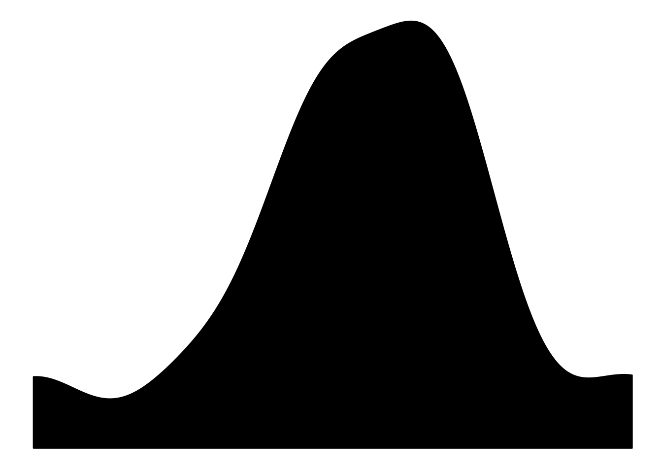
Before going any further, I want to illustrate what we will be using to train our model:
#Lubridate
ucdp$date_start <- dmy(ucdp$date_start)

ggplot(aes(x = date_start), data = ucdp[ucdp$dyad_new_id == 406 & ucdp$year == 1990, ]) +
  geom_density(fill = "black") +
  theme_void()
Just the (shadow?) event count density during the onset year. No annotations, no axes. Only a black and white square image (more on that in a bit). The challenge is that whether the peaks and curves and all contain enough information to differentiate single-year conflicts from their multi-year counterparts. Now, we will create these plots programmatically:
for (i in 1:nrow(active)) {
   p <- ggplot(aes(x = date_start), data = ucdp[ucdp$dyad_new_id == active$dyad_new_id[i] & ucdp$year == active$year[i], ]) +
               geom_density(fill = "black") + theme_void()
   ggsave(p, file = paste0(paste(active$dyad_new_id[i], active$year[i], active$duration[i], sep = "_"), ".png"),
          width = 1, height = 1, units = "in", path = "dens")
}
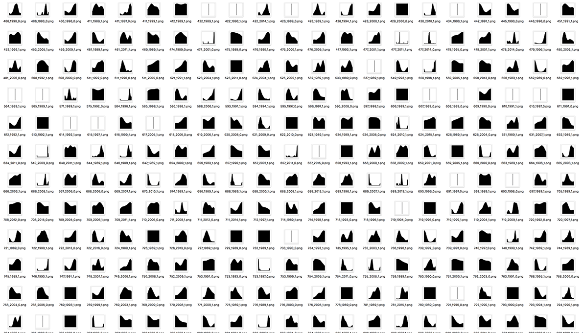
Running the above chunk will create a folder called ‘dens’ in your current working directory and populate it with 469 plots. 3 The naming convention is dyad.id_onset.year_duration.png. The size is set to 1 x 1 inches, which is a lot (matrix multiplication, people). You should be able to call image_resize_array via keras, however that didn’t work for me so I resorted to Photoshop. You can record key strokes in Photoshop and process a whole folder full of images just like ours. So I resized all plots to 28 x 28 pixels and converted them to greyscale. The latter saved us three dimensions; three RGB plus one alpha are reduced to one grey channel only. The whole process took around 45 seconds on my machine, however YMMV. Our mini attempt at creating modern art using R will look like this:

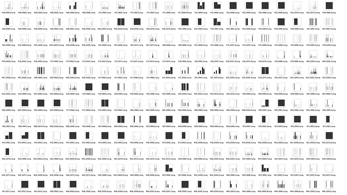
Or this, if we used geom_bar instead:

Reading-in Data to Keras
Okay, now we have to get the images into a dataframe so that we have their numerical representation. We can just reverse-engineer our plot-saving solution:
x <- list()
for (i in 1:nrow(active)) {
  t <- readPNG(paste0("hist/", paste(active$dyad_new_id[i], active$year[i], active$duration[i], sep = "_"), ".png"))
  t <- t[,,1]
  x[[i]] <- (t)
}
We first create an empty list outside the loop. Then, similar to the first loop, we go through every element of our active episodes dataframe and read in the .png files using the readPNG function of the png library. It would have been easier to just construct the names with a counter such as seq() earlier but I wanted to be able to verify quickly whether the loop worked or not.
#Read images from the loop list
load("x.RData")
images <- image_to_array(x)
dim(images)
## [1] 469 28 28#Reshape array into nrow times 784
images <- array_reshape(images, c(nrow(images), 784))
dim(images)## [1] 469 784#Split train/test
x_train <- images[trainIndex, ]
x_test <- images[-trainIndex, ]NaNaNaNa Neural Network
We have finally reached the fun part, Batman. I’m not the most NN-savvy person around so I will not pretend and try to lecture you. If you are a beginner, RStudio has a pretty neat guide and a cheatsheet to get you started. In a nutshell, we initialise our model by calling keras_model_sequential, and construct the network structure by specifying layers in order. The first layer must feature the input_shape, which in turn must match the dimensions of our array. We also need to specify activation functions, which there are about ten to choose from. The units represent the dimensionality of their output space. The dropout layers in between minimise the risk of overfitting by excluding the specified amount from being used in training so that the network does not co-adapt too much. We don’t use them here, but you can also add regularisation, pooling, and convolution layers that go from 1d to 3d. When you have the default arguments filled, Keras automatically connects the layers:
model <- keras_model_sequential()
model %>%
  layer_dense(units = 1024, activation = "sigmoid", input_shape = c(784)) %>%
  layer_dropout(rate = .4) %>%
  layer_dense(units = 512, activation = "sigmoid") %>%
  layer_dropout(rate = .3) %>%
  layer_dense(units = 256, activation = "sigmoid") %>%
  layer_dropout(rate = .2) %>%
  layer_dense(units = 2, activation = "softmax")
We can get the current structure of our model by calling summary(model):
summary(model)## ___________________________________________________________________________
## Layer (type) Output Shape Param #
## ===========================================================================
## dense_1 (Dense) (None, 1024) 803840
## ___________________________________________________________________________
## dropout_1 (Dropout) (None, 1024) 0
## ___________________________________________________________________________
## dense_2 (Dense) (None, 512) 524800
## ___________________________________________________________________________
## dropout_2 (Dropout) (None, 512) 0
## ___________________________________________________________________________
## dense_3 (Dense) (None, 256) 131328
## ___________________________________________________________________________
## dropout_3 (Dropout) (None, 256) 0
## ___________________________________________________________________________
## dense_4 (Dense) (None, 2) 514
## ===========================================================================
## Total params: 1,460,482
## Trainable params: 1,460,482
## Non-trainable params: 0
## ___________________________________________________________________________Seven lines of code equals nearly 1.5M parameters. Whoa. To be honest, we don’t need three layers here at all but because our n is so small, might as well try our luck. Before running the model, you should also supply three functions to optimise (gain), minimise (loss) and to quantify performance (accuracy):
model %>% compile(
  optimizer = optimizer_adamax(),
  loss = loss_binary_crossentropy,
  metrics = metric_binary_accuracy)
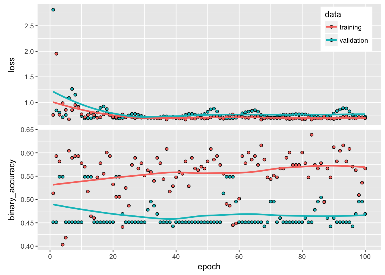
As with activation functions, there are several options for the each of the above; refer to the RStudio guide cited earlier to get a sense of what’s what. One should be able to set seed for Keras in R with use_session_with_seed(seed), as I have at the beginning of this post, however I can definitely tell you that it does not consistently work (also see issue#42, issue#119, and issue#120). So no promise of perfect reproducibility. Running the below will result in 100 runs over the whole training data, using 256 samples simultaneously in each iteration, with a 70/30 train/test split for in-sample validation:
history <- model %>% fit(
  x_train, y_train,
  epochs = 100, batch_size = 256,
  validation_split = .3)

#Default is ggplot so we can tweak it easily
plot(history) + theme(legend.position = c(.9, .9))
What’s up with the gatekeeping jargon? If you run the above chunk live, you’ll find that (in RStudio at least) you get a nice plot that automatically updates itself at the end of each epoch. I can tell you anecdotally that cheering for your neural network adds around +-3% accuracy on average. Finally, we can evaluate our model using the test data and extract out-of-sample predictions:
model %>% evaluate(x_test, y_test)## $loss
## [1] 0.6687286
##
## $binary_accuracy
## [1] 0.6021505model %>% predict_classes(x_test)## [1] 1 1 1 1 1 1 1 1 0 0 1 1 1 1 0 0 1 1 1 1 1 1 1 1 0 1 1 1 1 1 0 1 1 1 1
## [36] 1 1 1 1 1 1 1 1 0 1 1 1 1 1 1 1 1 1 1 0 1 1 0 1 1 1 1 1 1 1 1 1 1 1 1
## [71] 1 1 1 1 1 1 1 1 1 0 1 1 1 1 1 1 1 1 1 1 1 0 1Apparently, a bunch of pixelated greyscale images can predict with 60% accuracy whether the conflict will be active next year. Note that 60% is nothing if you are used to MNIST data in which anything can get 99% accuracy without breaking a sweat. However, the more social-sciency issues you deal with, the lesser the precision. Up until a couple of years ago, the best predictive work in conflict research had around ~67% accuracy. 4 With that said, we see that the model more or less predicted 1’s all over the board, so it could be that we just got a lazy model that looks a bit more organic than it actually is. I would have liked to finish on a ‘more research is needed’ note, but probably not.
The other two are non-state and one-sided violence, see here.↩
Not the UCDP data, but the images we are going to create soon.↩
I might have created an empty directory first, so try doing that if R throws you an error.↩
Obviously, they were making way more challenging predictions and not just the follow-up year. See one summary here.↩