Supervised vs. Unsupervised Learning: Exploring Brexit with PLS and PCA
Feb 14, 2018 · 2410 words · 12 minutes read
Outcome Supervision
Yesterday I was part of an introductory session on machine learning and unsurprisingly, the issue of supervised vs. unsupervised learning came up. In social sciences, there is a definite tendency for the former; there is more or less always a target outcome or measure that we want to optimise the performance of our models for. This reminded me of a draft that I had written the code a couple of months ago but for some reason never converted into a blog post until now. This will also allow me to take a break from conflict forecasting for a bit and go back to my usual topic of UK. My frequent usage of all things UK is at such a level that my Google Search Console insights lists r/CasualUK as the top referrer. Cheers, mates!
UK General Elections and Brexit
I think I have exploited rvest enough recently, so I will rely on a couple of good old csv’s this time. The Electoral Commission website provides the EU referendum voting totals by region. I want to combine electoral data with other socio-economic indicators so I will subset the data to London only (this is how privilege perpetuates itself). Within that subset, I will only keep the area code (for matching purposes later), and the raw number of votes for each option in the referendum. I will also create a variable indicating ‘the outcome’ based on which side got more votes:
#Load the required libraries
library(tidyverse)
library(caret)
library(pls)
library(e1071)
library(corrplot)
library(rgdal)
library(tmap)
library(plyr)
library(gridExtra)

#EU Referendum data for London
eu <- read_csv("eu_ref.csv")
eu <- eu[eu$Region == "London", c("Area_Code", "Remain", "Leave")]
eu$Outcome <- ifelse(eu$Leave > eu$Remain, "Leave", "Remain")
I supplement the referendum outcomes using data supplied by the London Datastore. The data structure is quite hostile to R (i.e. death by government-issue free-form Excel), so I cleaned it up manually a bit first. Let’s read in that version:
#London Borough data
london <- read_csv("london.csv")
london <- london[2:33, ]
According to the website,
“…The London Borough Profiles help paint a general picture of an area by presenting a range of headline indicator data in both spreadsheet and map form to help show statistics covering demographic, economic, social and environmental datasets for each borough, alongside relevant comparator areas.”
Excellent. Now, one of the downsides of resurrecting months-old code is that sometimes, you don’t remember why you did something the way you did…
#Checking which columns have missing values
have.na <- NULL
for (i in 1:length(london)) {
  counter <- ifelse(sum(is.na(london[, i])) > 0, 1, 0)
  have.na <- c(have.na, counter)
}
colnames(london)[which(have.na == 1)]
## [1] "GAP" "Male_GAP" "Fem_GAP"#Remove columns with NAs
london <- london[, -which(have.na == 1)]At least I do add comments even for trivial things. A bit convoluted for the task at hand, perhaps. Anyway, I will leave it in for posterity. Moving on, we can now combine the two datasets and name it accordingly:
#Merge the datasets by region code
colnames(eu)[1] <- "Code"
eu$Code <- as.character(eu$Code)
irony <- inner_join(eu, london, by = "Code")
Rumour has it that the above code chunk is my current Facebook cover image. Where’s my biscuit?
Most of the variables are actually percentages rather than counts. We can write up a basic helper function to identify which ones have values bounded by 0-100. Naturally, we will misidentify some along the way so we’ll just remove them manually afterwards: 1
#Function to check whether a column is in the 0-100 range
in_range <- function(x) {
  holder <- range(x)
  if (holder[1] >= 0 & holder[2] <= 100) TRUE else FALSE
}

#Only select such columns
percentage <- colnames(select_if(irony, in_range))
percentage
## [1] "Mean_Age" "Population_0_15"
## [3] "Working_Age_Population" "Population_65"
## [5] "Born_Abroad" "Largest_Mig_Pop"
## [7] "Second_Largest_Mig_Pop" "Third_Largest_Mig_Pop"
## [9] "BAME_Population" "English_Not_First_Lang"
## [11] "Employment_Rate" "Male_Employment"
## [13] "Female_Employment" "Unemployment"
## [15] "Youth_Unemployment" "Youth_NEET"
## [17] "Working_Age_Benefits" "Working_Age_Disability"
## [19] "No_Qualifications" "Degree"
## [21] "Volunteer" "Employed_Public_Sector"
## [23] "Job_Density" "Business_Survival"
## [25] "Fires_Per_Thousand" "Ambulance_Per_Hundred"
## [27] "House_Owned" "House_Bought"
## [29] "House_Council" "House_Landlord"
## [31] "Greenspace" "Recycling"
## [33] "Cars_Per_Household" "Cycle"
## [35] "Public_Trans_Access" "High_Grades"
## [37] "Child_Care" "Pupil_English_Not_First"
## [39] "Male_Life_Expectancy" "Female_Life_Expectancy"
## [41] "Teenage_Conception" "Life_Satisfaction"
## [43] "Worthwhileness" "Happiness"
## [45] "Anxiety" "Childhood_Obesity"
## [47] "Diabetes" "Tories"
## [49] "Labour" "Lib_Dems"
## [51] "Turnout"#Remove age and other non-% variables from the list
percentage <- percentage[-c(1, 25:26, 33, 37, 42:45)]
#Update names
names(irony) <- ifelse(names(irony) %in% percentage,
paste0(names(irony), "_%"), names(irony))
head(colnames(select(irony, ends_with("%"))))## [1] "Population_0_15_%" "Working_Age_Population_%"
## [3] "Population_65_%" "Born_Abroad_%"
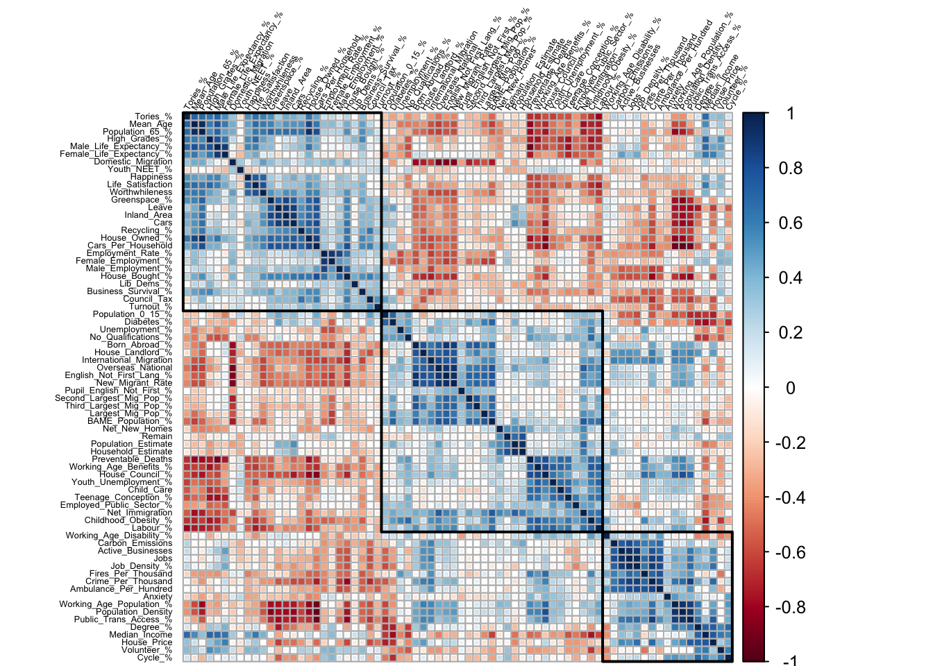
## [5] "Largest_Mig_Pop_%" "Second_Largest_Mig_Pop_%"Before moving on, let’s also check which variables are correlated with each other. Also, everyone loves correlation plots. To me, they are akin to Apple products—they always look cool, but their utility is situational. They also get increasingly difficult to interpret when n > 15ish. However, they have another useful function: you can specify the number ‘blocks’ that you want to divide the correlation plot if you opt for hierarchical clustering. Say, we want to identify three such blocks in the data:
#Plot correlation matrix
M <- cor(select_if(irony, is.numeric))
london.matrix <- corrplot::corrplot(M, order = "hclust", tl.cex = .4,
                                    method = "square", type = "full",
                                    tl.pos = "dt", addrect = 3,
                                    tl.col = "black", tl.srt = 60)
Larger version here. The first rectangle (top left), let’s call it the Tory block as the first row/column is Tory voting percentage. We see that it is positively correlated with indicators such as voting Leave, high income/employment, old age, happiness/worthwhileness (?) etc. In other words, it passes the eye test for potential conservative party leanings. Conversely, the middle block is the ‘Labour’ counterpart. The correlated indicators revolve around issues such as voting Remain, young immigrant population, English not being the first language, benefits, unemployment. Again, passes the sanity check (hold your horses Tories, reverse causality and all). Finally, we have a smaller block (bottom right), which I’ll call the ‘Non-Aligned’. This cluster is curious: Basically, it represents the people living in the City—as indicated by high population/job density, median income, and police/ambulance/fire emergencies per thousand. Note that not everything in a block is necessarily (positively) correlated with each other; only the blue shades are.
We can also just rely on numbers to identify correlations above a specified threshold (albeit without clustering so less useful):
#Numerical version
correlated <- sort(findCorrelation(M, cutoff = .8, exact = TRUE))
colnames(M[, correlated])
## [1] "Household_Estimate" "Inland_Area"
## [3] "Population_Density" "Mean_Age"
## [5] "Working_Age_Population_%" "Population_65_%"
## [7] "International_Migration" "English_Not_First_Lang_%"
## [9] "Overseas_National" "New_Migrant_Rate"
## [11] "Employment_Rate_%" "Job_Density_%"
## [13] "Active_Businesses" "Crime_Per_Thousand"
## [15] "Ambulance_Per_Hundred" "House_Owned_%"
## [17] "House_Bought_%" "House_Council_%"
## [19] "Carbon_Emissions" "Cars"
## [21] "Cars_Per_Household" "Public_Trans_Access_%"
## [23] "Male_Life_Expectancy_%" "Preventable_Deaths"
## [25] "Labour_%"Principal Component Analysis (PCA)
Probably the most commonly-used unsupervised learning technique alongside k-means clustering is the Principal Component Analysis. It’s so common that it’s probably your best bet for de-mystifying unsupervised learning; many have utilised the technique using commercial software such as SPSS/STATA. PCA is well-liked because it is pretty efficient at reducing dimension and creating uncorrelated variables (components), which helps with model stability. On the other hand, it is susceptible (or drawn) to high-variance variables; if you measure the same phenomenon in days and in months, the former will be picked up in the earlier components. The downside is that the model might focus on sorting variance rather than identifying the underlying data structure. Second, as the technique is unsupervised, the components maximise capturing variance without regard to an outcome. Meaning, your uncorrelated components only work in supervised settings if the captured variance is correlated with the outcome. Let’s unpack that a bit. First, we will allocate the columns from our aforementioned blocks and apply some diagnostics:
#Get colnames for splitting PCs
tories <- colnames(london.matrix[, 1:26])
labour <- colnames(london.matrix[, 27:55])
non.aligned <- colnames(london.matrix[, 56:72])

#Checking for possible data transformations
skew.values <- apply(select_if(irony, is.numeric), 2, skewness)
#Display top ten most skewed variables
head(sort(abs(skew.values), decreasing = TRUE), 10)
## Lib_Dems_% Job_Density_% Jobs
## 3.358732 3.250213 3.043243
## Active_Businesses Crime_Per_Thousand House_Price
## 2.862152 2.140319 2.057096
## Ambulance_Per_Hundred Carbon_Emissions Third_Largest_Mig_Pop_%
## 2.005706 1.606982 1.592895
## Council_Tax
## 1.465253#Look for non-zero variance predictors
nearZeroVar(irony)## integer(0)Looking good. Now we can actually create the PCs. For this exercise I will not split the data into train/test as we won’t be forecasting. I will rely on caret to do the transformation; however there are many other packages that you can use. We will center and scale the variables and perform PCA capturing at least 95% of the variance:
#Create PCs based on correlated blocks
tory.trans <- preProcess(x = irony[, tories],
                         method = c("center", "scale", "pca"),
                         thresh = 95)
pca.data <- predict(tory.trans, irony)
#Look into PC1 loadings
head(sort(tory.trans$rotation[, 1], decreasing = TRUE))
## Population_65_% House_Owned_% Cars_Per_Household
## 0.2764259 0.2763916 0.2714639
## Mean_Age Greenspace_% Cars
## 0.2581242 0.2363438 0.2349750Let’s quickly do the same for Labour and the non-aligned block:
#Repeat for other parties
labour.trans <- preProcess(x = pca.data[, labour],
                           method = c("center", "scale", "pca"),
                           thresh = 95)
pca.data <- predict(labour.trans, pca.data)
head(sort(labour.trans$rotation[, 1])) #All loadings are negative
## Overseas_National BAME_Population_% Net_Immigration
## -0.2721566 -0.2675754 -0.2600342
## Childhood_Obesity_% New_Migrant_Rate Labour_%
## -0.2552952 -0.2504425 -0.2461091non.trans <- preProcess(x = pca.data[, non.aligned],
method = c("center", "scale", "pca"),
thresh = 95)
pca.data <- predict(non.trans, pca.data)Finally, we can now subset the PCs themselves and merge it with the main dataset:
#Get rid of unnecessary columns and rename PCs
pca.data <- pca.data[, c(1, 6:11)]
colnames(pca.data) <- c("Code", "Tory_PC1", "Tory_PC2",
                        "Labour_PC1","Labour_PC2",
                        "NonAligned_PC1", "NonAligned_PC2")

brexit <- inner_join(irony, pca.data, by = "Code")
Partial Least Squares (PLS)
In contrast, Partial Least Squares is a PCA that is told the outcome so it has something to calibrate to. If you also happen to have a printed copy of Applied Predictive Modeling, Kuhn and Johnson touch upon this on page 37. Paragraph three, towards the end. Done reading? Good. On that note, Max is on Twitter now:
 Talk about an impossible task.
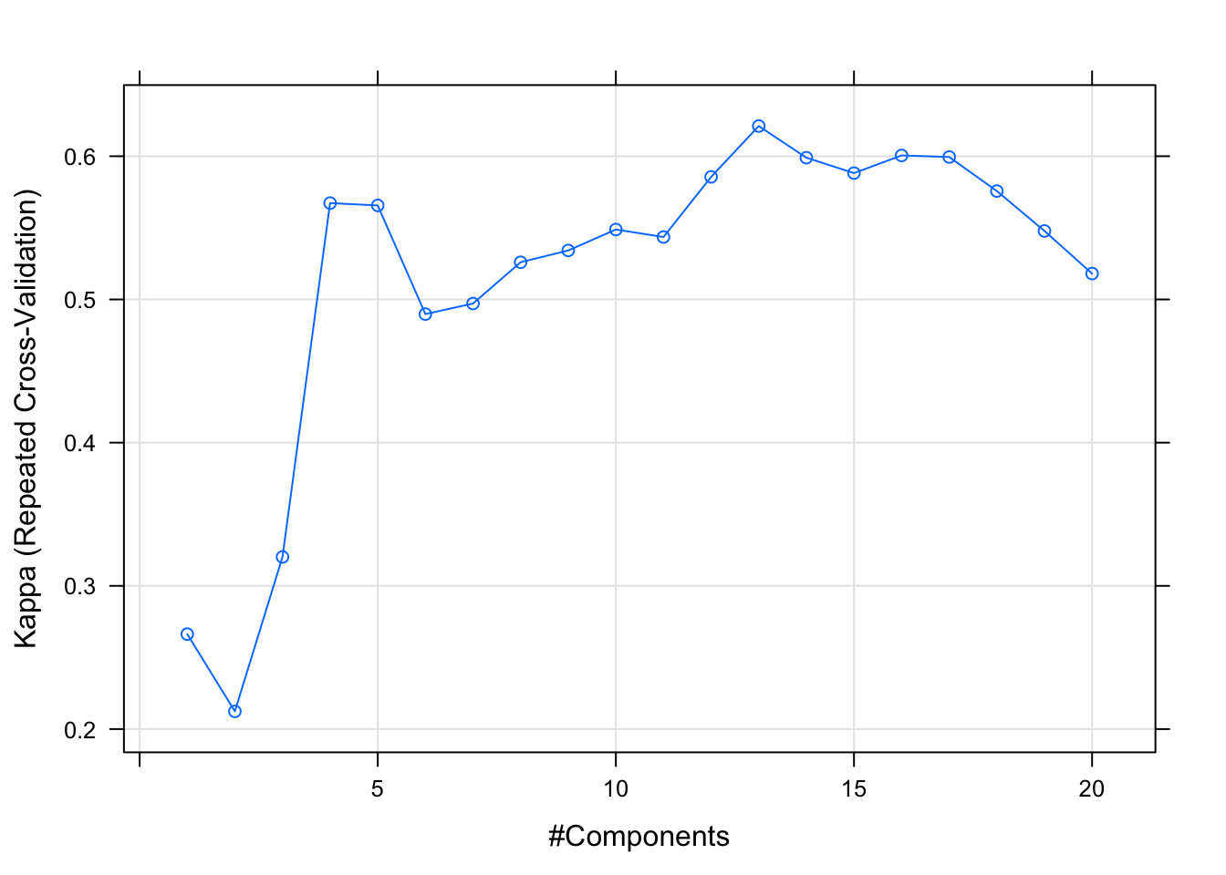
PLS is a supervised technique as we are supplying an outcome found in the data; in our case, whether the borough voted Leave/Remain. Let’s set up a standard caret operation using a repeated 5-k fold, and specify we want upsampling (to offset the class imbalance as most London boroughs voted Remain) and follow the one-standard-error rule for model selection:
#Partial Least Squares
folds <- createMultiFolds(brexit$Outcome, k = 5,  times = 10)
tr.ctrl <- trainControl("repeatedcv", index = folds,
                        selectionFunction = "oneSE", sampling = "up")
Let’s set the tune length to 20 and use Kappa as the accuracy metric. Don’t forget to remove the outcome from the right-hand side and apply the standard pre-processing procedures (remove zero-variance indicators, center and scale):
#Train Tory model
set.seed(1895)
tory.fit <- train(y = brexit$Outcome, x = brexit[, tories[-13]],
                  method = "pls",
                  metric = "Kappa",
                  tuneLength = 20,
                  trControl = tr.ctrl,
                  preProc = c("zv", "center", "scale"))

plot(tory.fit)
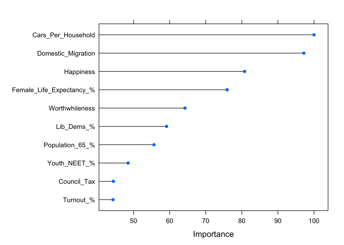
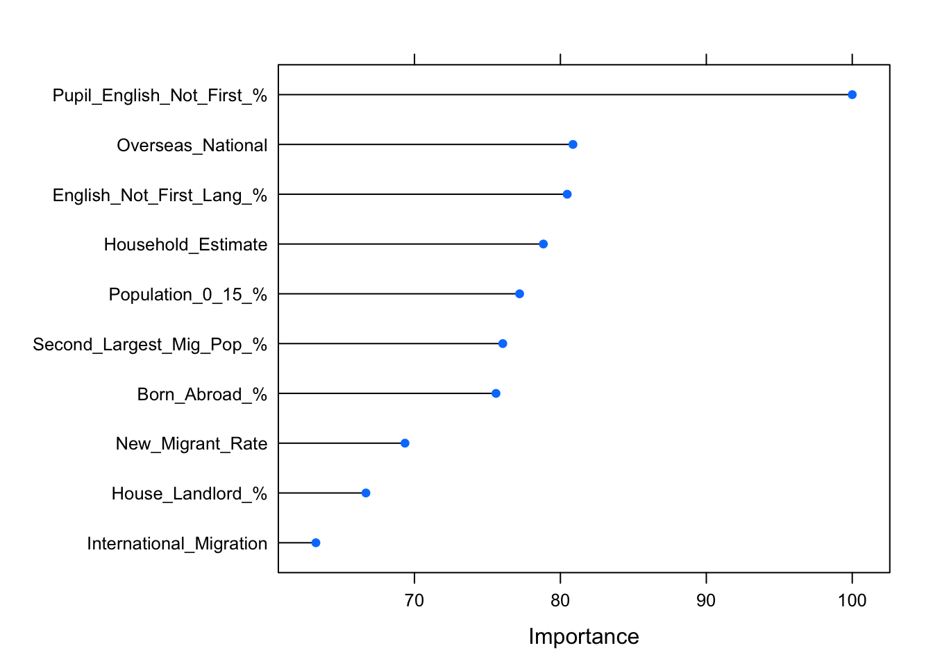
caret also makes it easy to extract and visualise the top n variables (in terms of their predictive accuracy):
plot(varImp(tory.fit), 10)Lib Dems incursion into Tory territory! Let’s repeat the same for the Labour side:
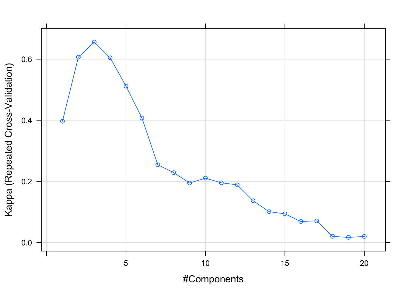
#Train Labour model
set.seed(1895) #Let's not take chances
labour.fit <- train(y = brexit$Outcome, x = brexit[, labour[-17]],
                    method = "pls",
                    metric = "Kappa",
                    tuneLength = 20,
                    trControl = tr.ctrl,
                    preProc = c("zv", "center", "scale"))

plot(labour.fit)plot(varImp(labour.fit), 10)So in our case, the issue of supervision does not seem to radically change the findings. Both the PCA and PLS seem to agree: if we simplify greatly, older, happier, richer people vote Tory and Leave; whereas young, diverse, less financially-able people vote Labour/Remain. Both of which are admittedly not ground-breaking insights. But for our purposes, we show that in this case, maximising variance in the data actually lends itself well to predicting our outcome of interest.
Mapping the Loadings
Keeping up with the data visualisation focus of this blog, let’s create a map of London boroughs highlighting the above findings. Similar to the setup of mapping Westeros in R, you need to have all the shape files in your current directory for the "." argument to work. We can then match the borough by their area code:
#London Boroughs Shapefile
boroughs <- readOGR(".", "London_Borough_Excluding_MHW")
#Remove City of London as it has no voting data
boroughs <- boroughs[boroughs@data$NAME != "City of London", ]

#Merge spatial and non-spatial data
geo.data <- merge(boroughs, brexit, by.x = "GSS_CODE", by.y = "Code")
We have several options for visualisation here. We can have the loadings for each PC by party colouring the boroughs, which would help us see the variation between them. We can also add a basic histogram showing the distribution of the top variables (in each component) and overlay coloured indicators within each borough to see whether we can find something interesting there:
#Visualisation
tm_shape(geo.data) +
#PC loadings data
tm_fill(c("Tory_PC1", "Tory_PC2", "Labour_PC1", "Labour_PC2"),
palette = list("-Blues", "-Blues", "-Reds", "-Reds"),
style = "order", auto.palette.mapping = TRUE, contrast = .8,
legend.is.portrait = FALSE, legend.show = FALSE) +
#Titles
tm_layout(main.title = "Principal Components & Their Top Variables | London Boroughs", legend.position = c(0, 0),
title = list("% Population over 65",
"% House Owned Outright",
"Overseas Nationals (NINo)",
"Children Looked After per 10K"),
panel.show = TRUE, panel.label.size = 1.4,
panel.labels = c("Tory PC1 values in blue, darker shades are negative",
"Tory PC2 values in blue, darker shades are negative",
"Labour PC1 values in red, darker shades are negative",
"Labour PC2 values in red, darker shades are negative"),
fontfamily = "Roboto Condensed", between.margin = 0, asp = 1.78, scale = .6) +
#Overlay data options
tm_symbols(col = c("Population_65_%", "House_Bought_%", "Overseas_National", "Child_Care"),
title.col = "", n = 4,
scale = 1, shape = 24, border.col = "black", border.lwd = .6, border.alpha = .5,
legend.hist = TRUE, legend.hist.title = "Distribution") +
#Border transperancy
tm_borders(alpha = .4)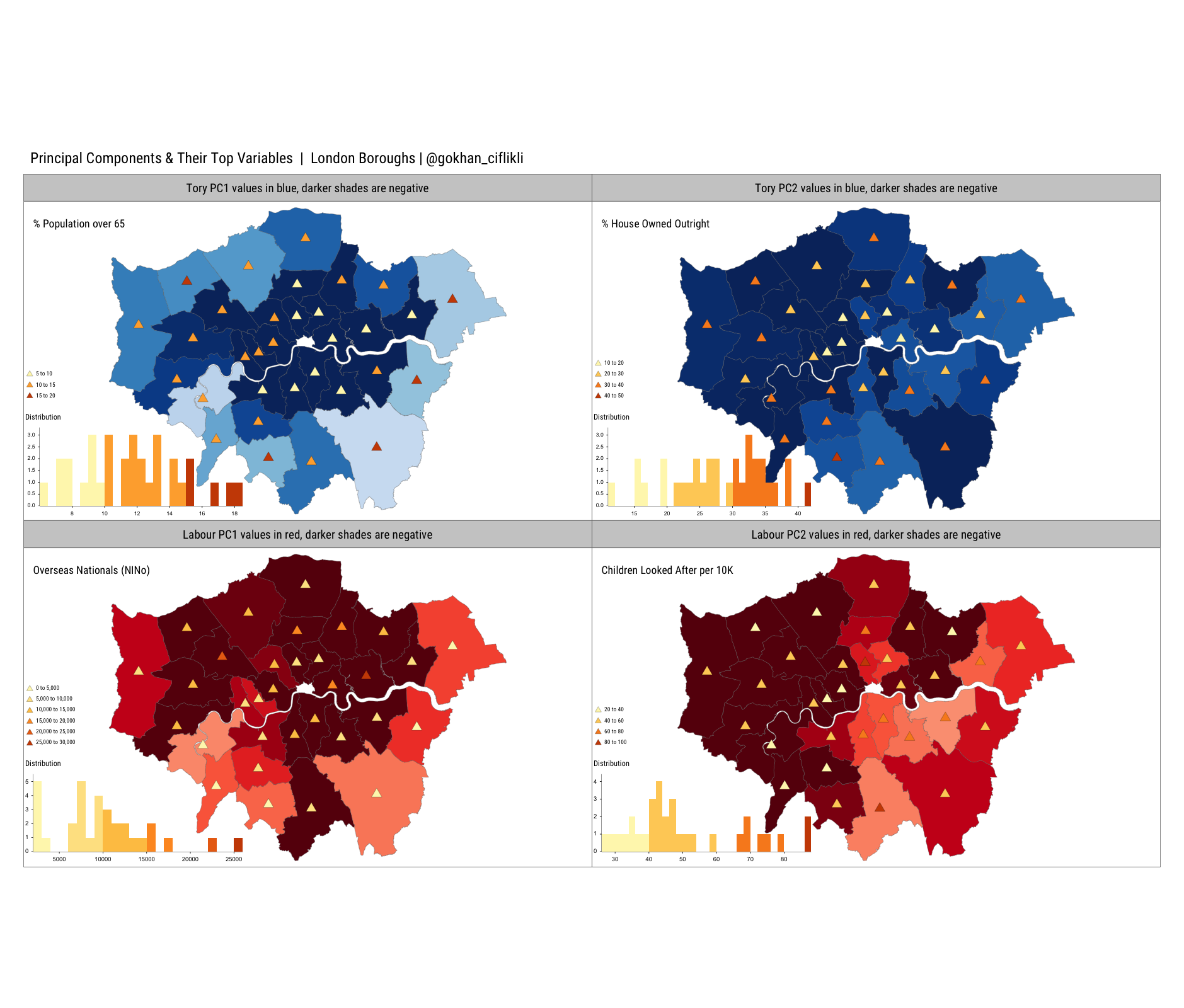 Click here for a larger pdf version. Let’s analyse what we see in the top left panel, which visualises the first Tory PC loadings and the highest ranked variable within that component; the percentage of population over the age of 65. The blues represent the loading values; darker shades are negative whereas lighter shades are positive. One way to look at this is that ‘inner’ London is different than ‘outer’ London for this PC (remember, PCA maximises variance for its own sake). In this case, we find that this overlaps well with increasing share of senior citizens, who mostly live on the periphery (darker red triangles) and going by the histogram, constitute the smallest segment in the population. As usual, the code is available on GitHub, so good luck replicating comrade!
Curious though, no one in the dataset (well, London) is older than 100 years old? Hmm.↩
