Quantitative Story Telling with Shiny: Gender Bias in Syllabi
Jan 10, 2018 · 2208 words · 11 minutes read
LSE IR Gender and Diversity Project
Two shinydashboard posts in a row, that’s a first. As I mentioned on Twitter, I’m not really this productive; rather, the apps had been on the proverbial shelf for a while and I’m just releasing them now. In fact, this is one of my earlier works: quantifying the gender imbalance as it manifests itself in the LSE International Relations (IR) reading lists. You can access the app here.
This is a much larger project that I got involved during its second year, so I’m just visualising other peoples’ hard work.1 The recentness of my contribution to the project was clearly on display when I amused my audience by saying cross-sectional feminism instead of inter-sectional. Are you a statistician or what? Baby steps.
In a nutshell, about twenty or so PhD candidates at the department manually (!) scraped the reading lists of 43 courses that were on offer during the 2015-2016 academic year, resulting in a dataset containing 12,358 non-unique publications.2 Of those, 2,574 involves at least one female author, while 9,784 features at least one male author. Morevoer, 78% of the syllabi is written exclusively by male scholars.
Recently, I have been working on a talk proposal about (Shiny) design, so I will let some of those guidelines dictate the structure for the rest of this post. I will touch upon three main themes: i) how to emphasise contrast and make a point out of it, ii) how to unpack the whole and present disaggregated data, and iii) how to design useful interactivity that connects with your intended audience. As usual, there will be sprinkles of random thoughts and semi-relevant sidetracking in between.
On that note, this project used to be (still?) called the Gender and Diversity Project. You may have noticed that I struck through the latter bit in the title. Well, when I ran the classification models - predicting binary outcomes as male/female,3 diverse/not diverse etc. - two things stuck out. First, if you do not subsample, the sheer male dominance of the field will result in lazy models that are >90% accurate: it will always predict male, and will be correct most of the time (especially when you subset the data). Naturally, this is uninformative.
However, the second point eclipses the first: when you try to predict diversity, well, you can’t. Because even though women are severely under-represented (leading to lazy algorithms), everyone is white. You can’t even make a cross-section joke anymore. Another unintended side effect of this is that if you rely on an API like genderize, you don’t have to worry about whether it will work well on, say, an Indian name. Feel free to make your own inferences about the state of the discipline.
Visualising Contrast
On that uplifting note, let’s move on to the first theme: contrast. What I mean by contrast here is striking difference, or difference in juxtaposition; not the graphical design contrast/hue/saturation.4 Given the subject matter, I thought a basic comparison over time stratified by gender will do nicely. It would not be surprising to see an increase in the number of included works by female authors as time progresses. However, we don’t know whether that (if exists) is an independent effect or a general one. We can set up a hover plot with ggplot2 to illustrate this point: the first (static) plot only shows the female author subset, and upon hovering/clicking, it reveals the second plot that displays the whole data. Like the previous post, I’m only providing unevaluated (read: motivational) code here; you can always fork the functional code on GitHub:
#Only the hover part of the Shiny code
  fluidRow(column(width = 6,
                  plotOutput("plot1", height = 400,
                             hover = hoverOpts(
                               id = "plot1_hover",
                               nullOutside = FALSE))),
          column(width = 6,
                 conditionalPanel(
                   condition = "input.plot1_hover != null",
                   plotOutput("plot2", height = 400))))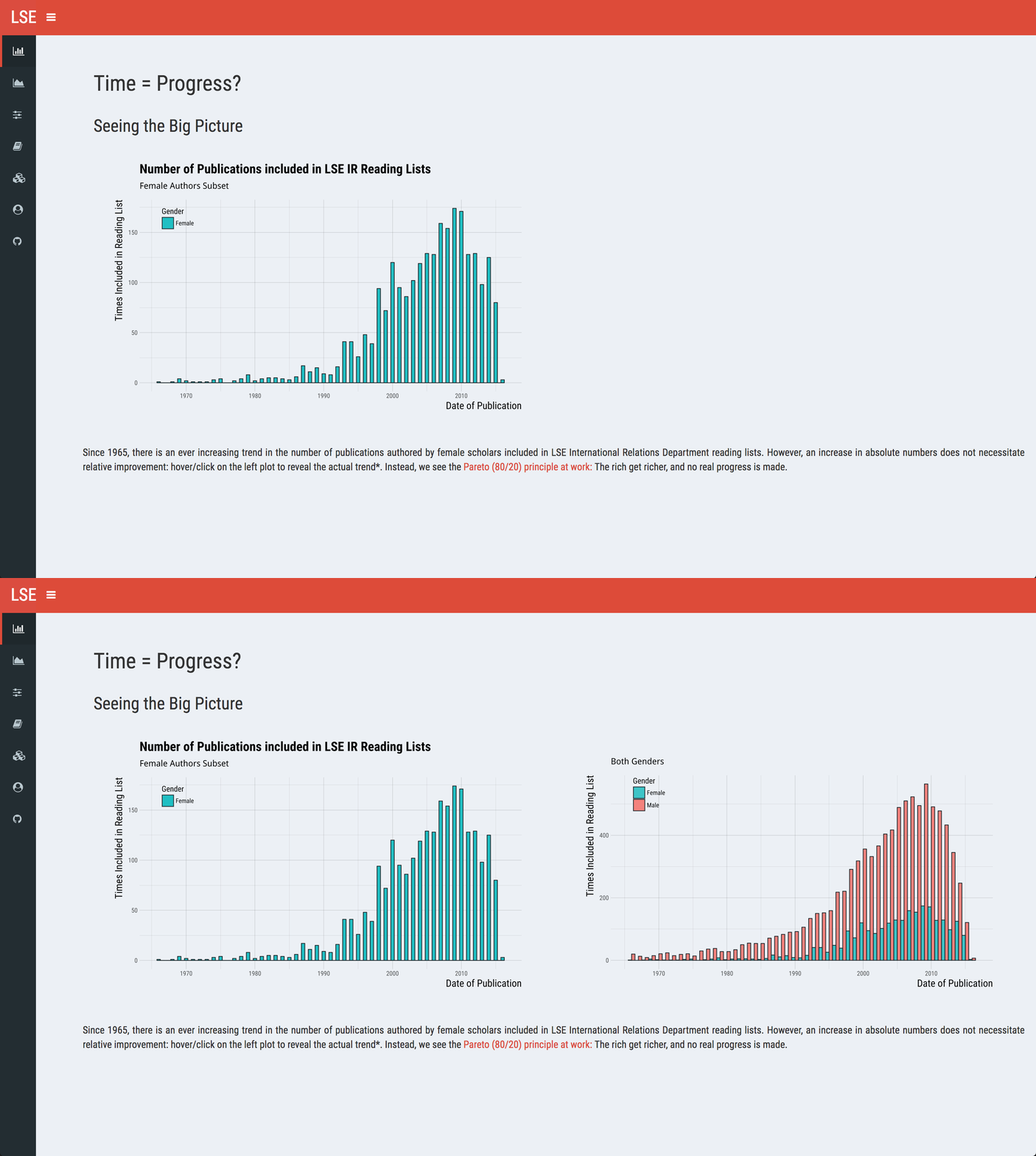
On the left panel, we see what we expected: works by female authors see a surge after 1990. The drop-off at the end is probably indicative of the lag present in publication date and the time needed to make it into a reading list. However, when we plot both genders on the right panel, we realise the trend is universal - male authors also get included more and more.
Our illustration demonstrates two separate effects. First, there is absolute improvement over time; in syllabi, the number of publications by female authors tripled in the last three decades. Second, there is comparatively little relative progress in the same timeframe. Any statement more precise than that will need to involve statistics (cough, we may have a manuscript under review).
One thing we may not have accomplished with the above is the clear communication of year-to-year ratios. We could have used stacked bar charts rather than histograms, but I wanted to divide the workload - don’t put all your tricks into one plot (as they are more likely to break). dygraphs is a powerful library and will serve our needs well with its interactivity. plotly can achieve similar results as well, but I used it as an example in my previous post so let’s go for diversity. Ha.
library(dygraphs)
dygraph(data = authors) %>%
      dyOptions(fillGraph = TRUE, fillAlpha = 0.1, panEdgeFraction = 0.1, drawPoints = TRUE,
                strokeWidth = 1.2, drawGapEdgePoints = TRUE, drawGrid = FALSE, mobileDisableYTouch = TRUE) %>%
      dyLimit(.2, color = "black") %>%
      dyLegend(width = 400, hideOnMouseOut = FALSE) %>%
      dyAxis("y", label = "Percentage of All Readings", valueRange = c(.01, 1.005), rangePad = 1) %>%
      dyAxis("x", label = "Date of Publication") %>%
      dySeries("V2", label = "Female Author Ratio", color = "#1fbfc3", stepPlot = TRUE) %>%
      dySeries("V3", label = "Male Author Ratio", color = "#f5766f", stepPlot = TRUE, fillGraph = TRUE)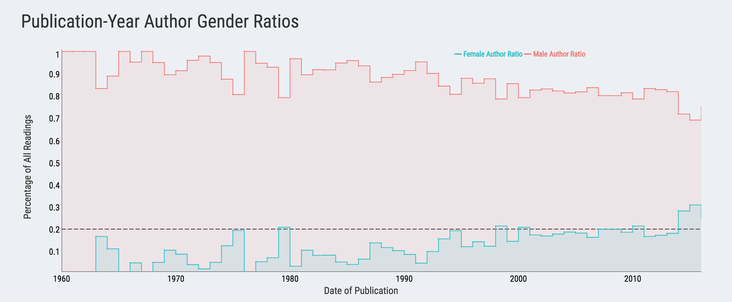
Now, we can see that the majority of publication-years include less than 20% female authors, indicated by the dashed line. In the live app, users can hover and the legend on the top right corner will update to display the ratios for both genders. Unsurprisingly, we observe a similar trend after 1990; the relative improvement is about double: pre-1990, the female author ratio averages around 10%, while post-1990 it’s about 20%. I believe I have already made a sarcastic remark about the state of the discipline.
Disaggregating Content
Okay, so we have all these crude yearly statistics and plotted them to the best of our ability. What next? We need to go deeper ala Inception. This part is naturally governed by the richness of your data. In our case, we have some publication characteristics (year, type, number of authors, author gender) and data on independent courses. Let’s illustrate them both.
Publication characteristics easily lend themselves to segmented, colour-coded graphics. There are multiple libraries that you can utilise in R. I will go with sunburstR for no other reason that I liked the graphics so much, I made it my website favicon. It’s also featured in my first blog post. We all have our favourites.
library(htmlwidgets)
library(sunburstR)
library(RColorBrewer)

blues <- c(brewer.pal(9, "Blues"))
reds <- c(brewer.pal(9, "Reds"))

#Sunburst using static patch data (code at the end makes sure the legend is on by default; use with htmlwidgets)

  output$sb <- renderSunburst({
    htmlwidgets::onRender(
      sunburst(patch, count = TRUE,
               legend = list(w = 150, h = 25, s = 5, t = 25),
               breadcrumb = list(w = 0, h = 25, s = 5, t = 10),
               colors = c("", blues[1:8], reds[7:2]),
               legendOrder = c("1960", "1970", "1980", "1990", "2000", "2010",
                               "Book", "Article",
                               "OtherPublisher", "TopPublisher",
                               "CoAuthored", "SingleAuthored",
                               "MaleCoAuthor", "FemaleCoAuthor"), withD3 = TRUE),
    "
    function(el,x){
    d3.select(el).select('.sunburst-togglelegend').property('checked', true);
    d3.select(el).select('.sunburst-legend').style('visibility', '');
    }
    "
    )
  })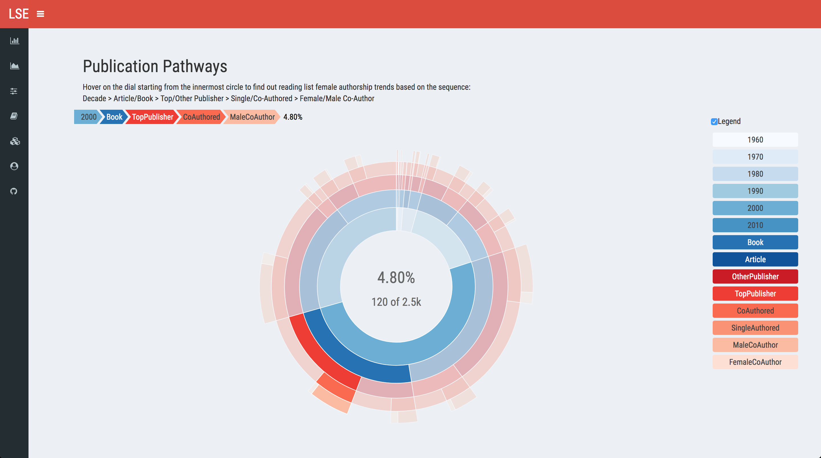
You will need to wrangle your data to create sequences that sunburstR can plot, which is usually achieved with multiple group_by arguments with dplyr. The JavaScript code at the end renders a click so that the legend is on by default. You need to load htmlwidgets first and make sure you pass withD3 = TRUE as an argument during the call. Users can navigate the dial inside-out and the selection descriptives will be displayed in the middle, both as percentages and as a raw count.
Moving onto course breakdown, I got inspired by the bokeh tutorial featuring the periodic table. We first cluster the courses into subfields of the discipline. Then, I manually (painfully) arranged the courses because all my automated attempts resulted in not-so-elegant outputs. Luckily, I happen to have a large whiteboard in my room (you don’t?), so I just drew the coordinate matrix there and then copy-pasted it. I’m sure you will find a way, too.
library(rbokeh)
#Bokeh using static course data

  output$bokeh <- renderRbokeh({
    figure(title = "",
           tools = c("pan", "wheel_zoom", "reset", "hover", "save"),
           font = "Roboto Condensed",
           ylim = as.character(1:6),
           xlim = as.character(0:14),
           xgrid = FALSE, ygrid = FALSE,
           xaxes = FALSE, yaxes = FALSE,
           height = 400, width = 1050,
           h_symmetry = TRUE, v_symmetry = TRUE,
           toolbar_location = "right") %>%
      #Create cluster boxes as indicators
      ly_crect(xcor, ycor, data = indicator, width = 2.95, height = .95,
               fill_color = colors, line_color = "#252525", fill_alpha = .6,
               hover = list(Subfield, Courses)) %>%
      ly_text(symx, ycor, text = clusters, data = indicator,
              font = "Roboto Condensed",
              font_style = "normal", font_size = "14pt",
              align = "center", baseline = "middle") %>%
      #Create centered rectangles
      ly_crect(xcor, ycor, data = course, width = .95, height = .95,
               fill_color = color, line_color = "#252525", fill_alpha = .6,
               hover = list(Convener, Readings)) %>%
      #F/M ratio
      ly_text(symx, ycor, text = Ratio, data = course,
              font = "Roboto Condensed",
              font_style = "bold", font_size = "14pt",
              align = "left", baseline = "middle") %>%
      #Core course indicator
      ly_text(symx2, numbery, text = Core, data = course, font = "Roboto Condensed",
              font_style = "bold", font_size = "6pt", align = "left", baseline = "middle") %>%
      #Course level
      ly_text(symx, massy, text = Level, data = course, font = "Roboto Condensed",
              font_size = "6pt", align = "left", baseline = "middle") %>%
      theme_title(text_font = "Roboto Condensed", text_font_size = "16pt",
                  background_fill_color = "#ecf0f5", text_font_style = "normal") %>%
      theme_plot(background_fill_color = "#ecf0f5", border_fill_color = "#ecf0f5", outline_line_alpha = 0)
  })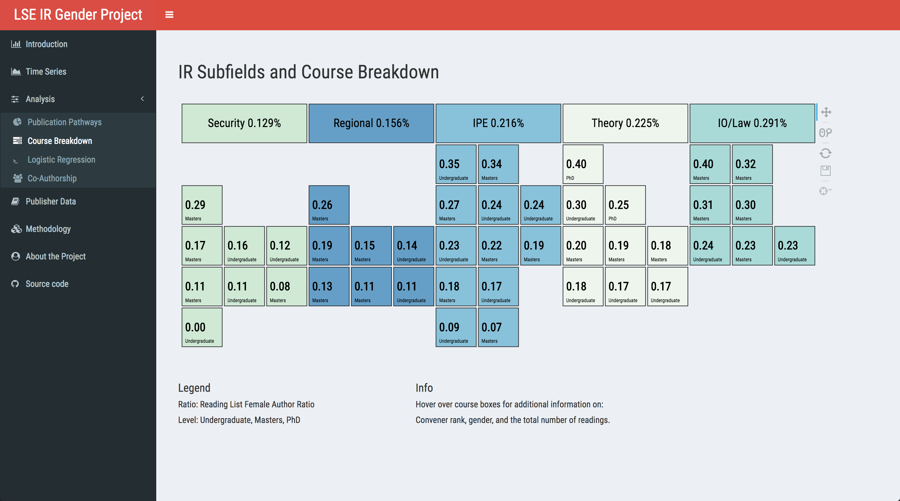
We want to convey two things at a glance with the course breakdown: which subfields feature more readings by female authors, and the level of dispersion within the clusters. Thus, I sorted the clusters from the lowest overall ratio to the highest, as well as dividing the courses into five categories. I removed both axes as they would be more confusing given the layout. In the app, you can hover on the boxes to reveal additional info: for courses, the gender and rank of the convener and the total of number of readings included; for clusters, it shows the full name of the subfield so that you can find out what IPE actually means.
Impactful Interactivity
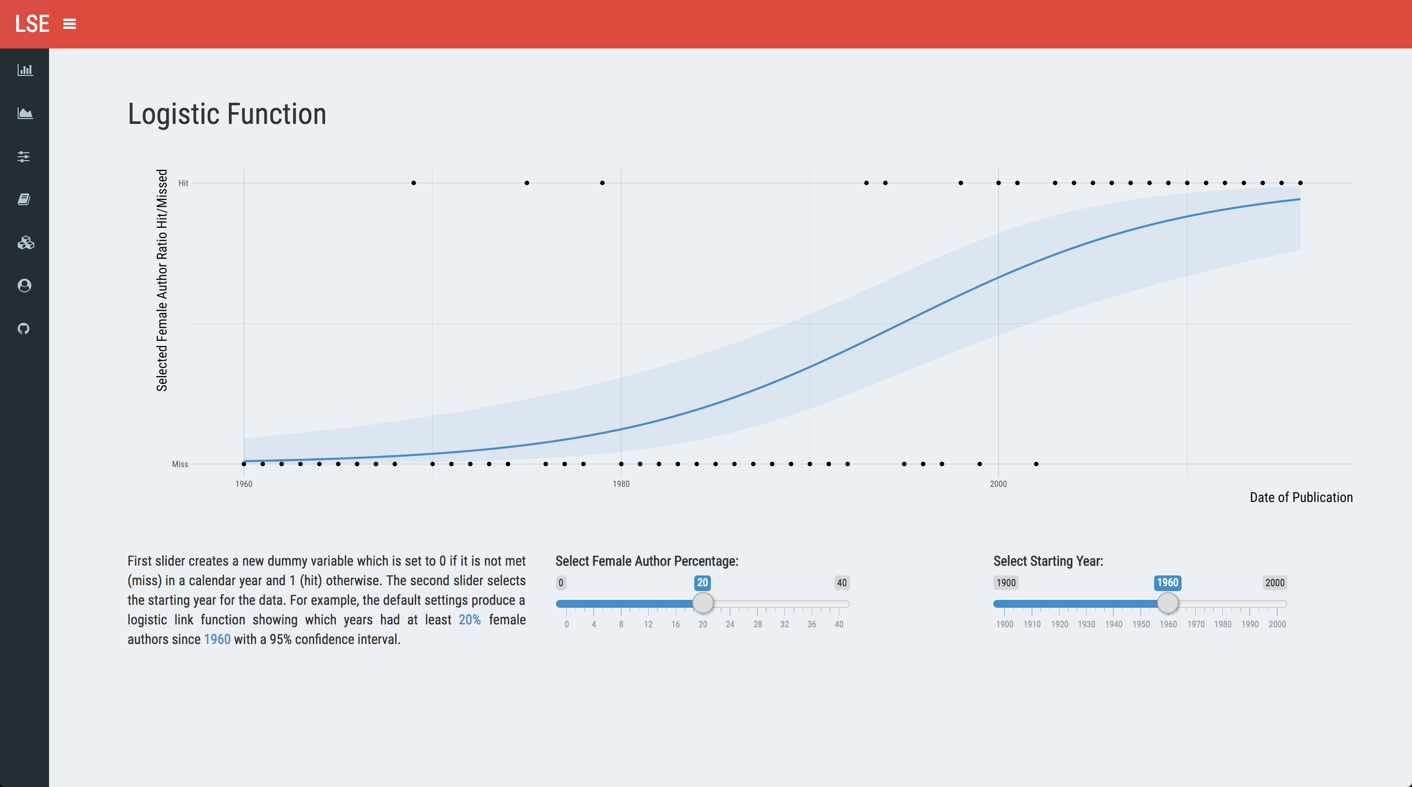
Finally, sometimes you want to give the users finer control over the end result. In the first couple of plots, they can see yearly ratios, but cannot do much more than that. One way of achieving this would be giving them control over creating yearly dummies and then plotting it as a binary outcome for whether that mark is reached or not. For example, you can manipulate the dataframe to create dummies for whether that year has equal or greater than 20% F/M ratio. I will not embed the code here as it is just a ggplot with slider inputs, but the output would look like the following:
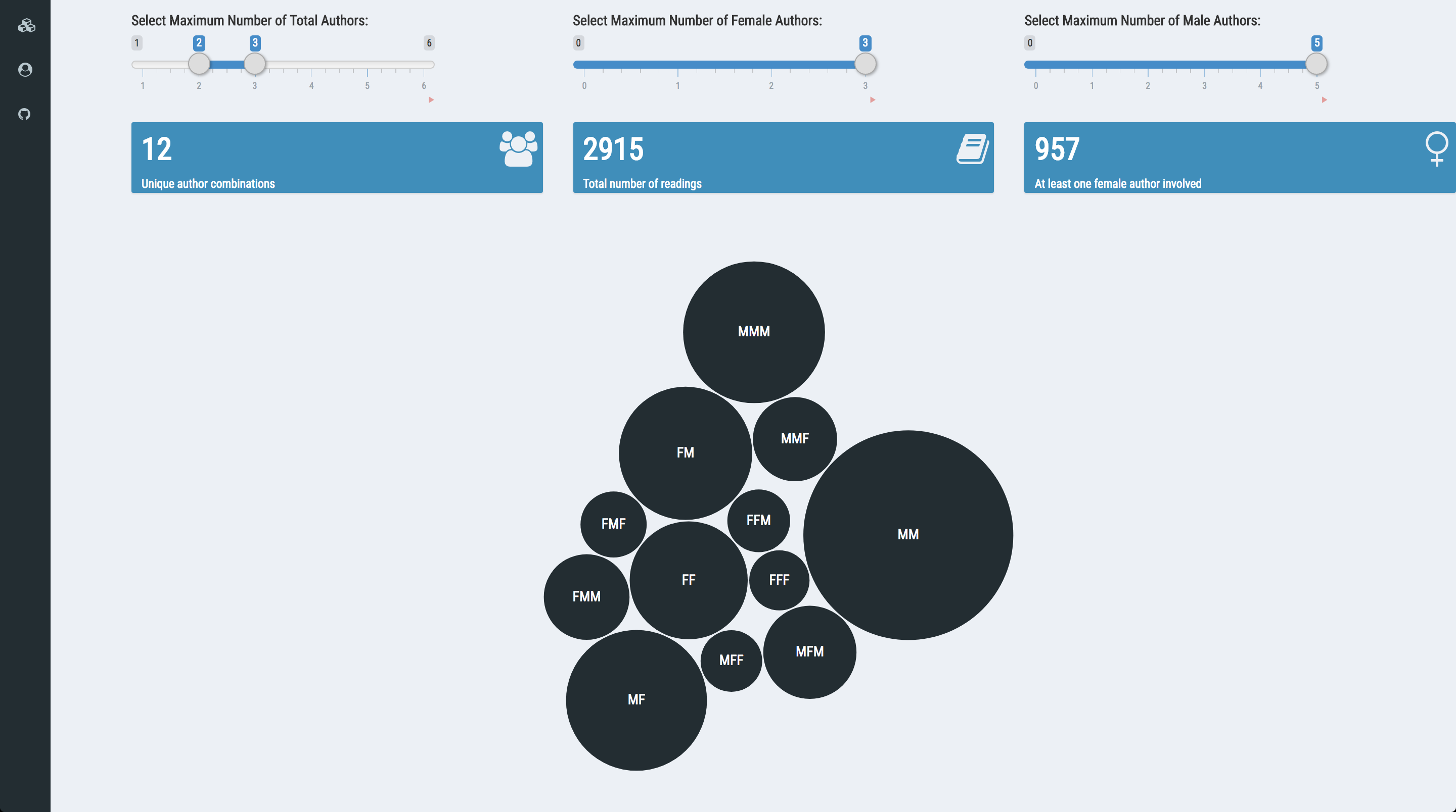
In addition, we can also give them control over visualising the co-authorship patterns. We have three variables of interest for each entry: the total number of authors, the number of female authors, and the number of male authors. I calcuate the circle radii using square root as otherwise you would only see a huge M (if you include single-authored work in the mix) and nothing else. We transform all three into sliders and emulate the CRAN package shiny app:
devtools::install_github("jcheng5/bubbles")
library(bubbles)
#Bubbles using reactive coData()

  output$bubbles <- renderBubbles({
    if (nrow(coData()) == 0)
      return()
    bubbles(sqrt(coData()$n), coData()$AutGen, key = coData()$AutGen,
            tooltip = coData()$n, color = "#222d32", textColor = "white")
  })
Last but not least, as this whole project is about publications, it wouldn’t be right to gloss over the publishers themselves. Again, we are looking at the publishers from a single-year snapshot of the LSE IR department, so it wouldn’t be poignant to generalise beyond that. At least, this is what reviewer 2 told us. Using DT, it’s a breeze to create interactive tables. In Shiny, do call renderDataTable via DT:
library(DT)
#selectedData will update based on slider settings
DT::renderDataTable(selectedData())
                     options(DT.options = list(
                       pageLength = 10, order = list(list(4, "desc")),
                       class = "hover",
                       language = list(search = "Enter Publisher Name:",
                                       info = "Displaying _START_ to _END_ of _TOTAL_ publishers")))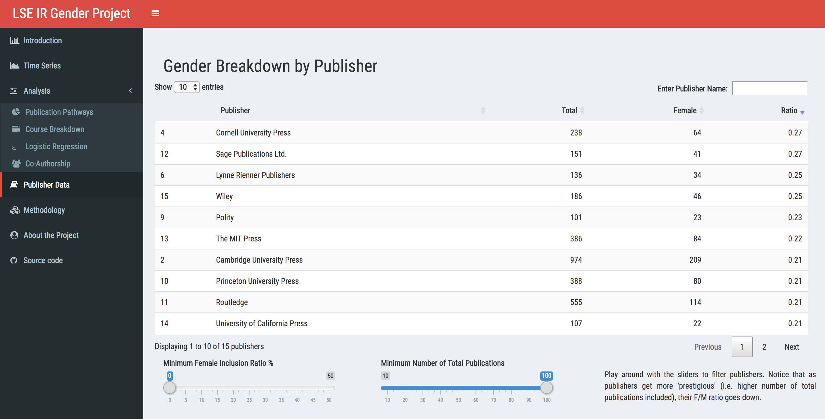
We see that the more ‘prestigious’ the publisher is, the more it gets close to the ‘status quo’ of 20% F/M ratio. However, if you decrease the number of total publications to ten (lowest allowed), you will find that there are publishers that go beyond 50%. Well, two of them, anyway.
The full list of contributors can be found in the about section of the app.↩
Non-unique as in, if an identical publication is included in two different courses, it’s counted twice.↩
Like many others, we had to resort to using a binary variable for coding purposes.↩
If you switch between R and Photoshop as frequently as I do, you’ll make some mistakes along the way.↩