Automatic Time-Series Forecasting with Prophet
Oct 22, 2017 · 2663 words · 13 minutes read
Seasonality and Trends
Time-series analysis is a battle on multiple fronts by definition. One has to deal with (dynamic) trends, seasonality effects, and good old noise. A general formula can be given as
y = level + trend + seasonality + noiseHowever, the relationships between these factors can be realized in many, and sometimes quite complex, ways. It is easy to over-fit noise, and the window for accurate prediction can be quite small (think of funnel-shaped confidence intervals).
Enter Prophet
For the purposes of this post, there will be roughly two groups of people based on their initial inference: the ones who think of a divine emissary and those who roll with Laurence “Prophet” Barnes. The first subset is likely to get inspiration from the Abrahamic tradition whereas the latter folks prefer shooting aliens in the face playing Crysis. Note that we do not enforce mutual-exclusiveness on this website, except for when we do. The royal we is good and alive. And we definitely thought of Mr. Nanosuit.

They call him Prophet…Remember him? Hint: He remembers you.
The Core Data Science team at Facebook developed an automated time-series forecasting package called the prophet. It is maintained in parallel in both R and Python. The needs of massive companies like Facebook can go beyond the standard A/B testing when they want to test many features (and have access to So.Much.Data.) at once. A lot of their product features can also be influenced by seasonal behaviors. It is promoted as an easier-to-use alternative to the forecast package.
London Weather
For those of us who do not have such data,1 a Google search is in order. Wanting to use London as a data example for a while, I happen to came across weather data. The European Climate Assessment & Data website offers free downloads of daily observations at meteorological stations throughout the region. I custom queried the mean temperature readings from Heathrow, UK that were recorded between 1960-01-01 and 2017-09-30. The resulting subset contains about 21k observations. We do not need the source id (only Heathrow) and measurement validity (no variation; all valid) columns.
londontmp <- read.csv("londontmp.txt")
dim(londontmp)
## [1] 21093 4colnames(londontmp)## [1] "SOUID" "DATE" "TG" "Q_TG"londontmp <- londontmp[, 2:3] #subset date and measurement
class(londontmp$DATE)## [1] "integer"The dates are imported as integers. Use lubridate package to correctly format the dates:
library(lubridate)
Sys.setenv(TZ = "Europe/London") #only for locals!
londontmp[, 1] <- ymd(londontmp[, 1], locale = Sys.getlocale("LC_TIME")) #locale can be skipped
Prophet expects ds and y as input. Furthermore, the temperature units are in 0.1C. We should correct both before moving on:
colnames(londontmp) <- c("ds", "y")
londontmp$y <- londontmp$y / 10
summary(londontmp$y)
## Min. 1st Qu. Median Mean 3rd Qu. Max.
## -8.90 6.70 11.10 11.11 15.60 29.00Now we have nearly 57 years worth of daily observations of mean temperature in London. It’s good practice to conduct a sanity-check—the summary statistics look OK, but sometimes you need to look:
h <- hist(londontmp$y, xlab = "Degrees Celcius",
          main = "Heathrow Temperature Readings 1960-2017",
          ylim = c(0, 3000))
xfit <- seq(min(londontmp$y), max(londontmp$y))
yfit <- dnorm(xfit, mean = mean(londontmp$y), sd = sd(londontmp$y))
yfit <- yfit * diff(h$mids[1:2]) * length(londontmp$y)
lines(xfit, yfit, col = "#5694f1", lwd = 2)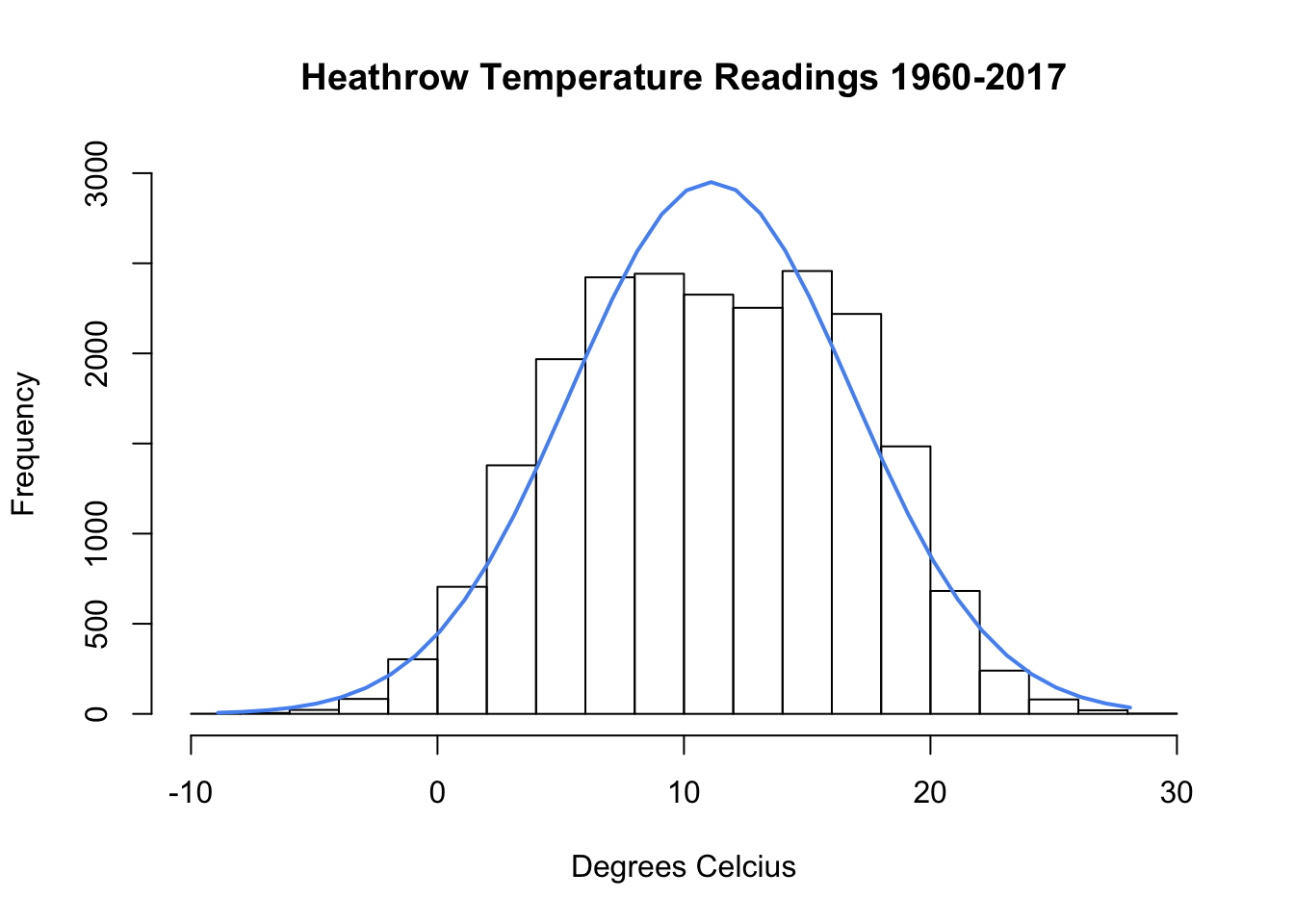
Looking good. You can also opt for the kernel density by plot(density(londontmp$y)) if you are so inclined.
The prophet package will take care of daily/monthly/yearly trends easily. However, we might be interested in trends longer than a year as well. Let’s look at decade averages. As it is the case in R, there are multiple ways of accomplishing the same task (looking at you, Py). I hope you don’t get triggered by nested ifelse usage, as I am a serial offender:
londontmp$year <- substr(londontmp$ds, 1, 4) #extract first four characters
londontmp$year <- as.integer(londontmp$year)
londontmp$decade <- ifelse(londontmp$year < 1970, "60s",
                            ifelse(londontmp$year < 1980, "70s",
                                ifelse(londontmp$year < 1990, "80s",
                                    ifelse(londontmp$year < 2000, "90s",
                                        ifelse(londontmp$year < 2010, "00s", "10s")))))
londontmp$decade <- as.factor(londontmp$decade)
londontmp$decade <- factor(londontmp$decade,
                           levels(londontmp$decade)[c(3:6, 1:2)]) #correct order
That should do. Let’s look for visual evidence of long-term change.
library(sm)
library(RColorBrewer)
colfill <- brewer.pal(6, "BrBG") #diverging palette
sm.density.compare(x = londontmp$y,
                   group = londontmp$decade,
                   xlab = "Mean Temperature (Celcius)",
                   col = colfill, lty = c(rep(1, 6)),
                   lwd = c(rep(2, 6)), xlim = c(-10, 30))
title(main = "Distributions by Decade")
legend("topright", levels(londontmp$decade),
       fill = colfill, bty = "n")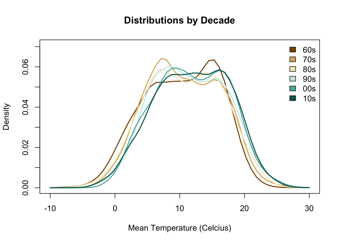
The decades are grouped into two chunks; earlier earth-colored and later green-hues. If we pay attention to \(t, t+1\) patterns, we can identify several trends. The most volatile change happens during the transition from 60s to 70s, a swing of about 10C in terms of the peaks (note that we are looking at densities). During the 80s, there is a similar reversal, but much smaller in magnitude. Actually, we spot somewhat stable mean temperatures (less sharper peaks) starting in 80s all the way to the present. We are definitely experiencing more higher-than-average days with every passing decade since then:
library(psych) #yes, yes sapply and dirty deeds...I like using packages
describeBy(londontmp[, 2], londontmp$decade)
##
## Descriptive statistics by group
## group: 60s
## vars n mean sd median trimmed mad min max range skew kurtosis
## X1 1 3653 10.26 5.7 10.6 10.4 6.67 -8.9 26.2 35.1 -0.2 -0.76
## se
## X1 0.09
## --------------------------------------------------------
## group: 70s
## vars n mean sd median trimmed mad min max range skew kurtosis
## X1 1 3652 10.66 5.6 10.5 10.64 6.67 -4.2 27.6 31.8 0.06 -0.71
## se
## X1 0.09
## --------------------------------------------------------
## group: 80s
## vars n mean sd median trimmed mad min max range skew kurtosis
## X1 1 3653 10.72 5.77 10.8 10.75 6.67 -7.6 27 34.6 -0.04 -0.66
## se
## X1 0.1
## --------------------------------------------------------
## group: 90s
## vars n mean sd median trimmed mad min max range skew kurtosis
## X1 1 3652 11.47 5.67 11.2 11.44 6.52 -5.4 27.4 32.8 0.04 -0.66
## se
## X1 0.09
## --------------------------------------------------------
## group: 00s
## vars n mean sd median trimmed mad min max range skew kurtosis
## X1 1 3653 11.83 5.61 11.7 11.85 6.38 -2.2 29 31.2 0 -0.73
## se
## X1 0.09
## --------------------------------------------------------
## group: 10s
## vars n mean sd median trimmed mad min max range skew kurtosis
## X1 1 2830 11.92 5.69 12.05 12.02 6.45 -4.1 28.7 32.8 -0.11 -0.66
## se
## X1 0.11Let’s the see the magic of the prophet. (Sub) Daily seasonality is set to FALSE by default, I just wanted to highlight as it is a new feature. Our data do not have time-stamps so we cannot take advantage of it. You can also allow for MCMC sampling, although we will just go ahead using the package out-of-the-box.
library(prophet)## Warning: package 'Rcpp' was built under R version 3.4.2set.seed(1895) #in case you pass mcmc.samples below
m <- prophet(londontmp, daily.seasonality = FALSE)## Initial log joint probability = -429.609
## Optimization terminated normally:
## Convergence detected: relative gradient magnitude is below toleranceFollowing the vignette, we need to create a holder for future dates first. If you include history, the new dataset will have all the existing rows plus the ones created for the forecast. Below, we only create the dataframe for next two years:
future <- make_future_dataframe(m, periods = 365 * 2,
                                include_history = FALSE)
head(future)
## ds
## 1 2017-10-01
## 2 2017-10-02
## 3 2017-10-03
## 4 2017-10-04
## 5 2017-10-05
## 6 2017-10-06Unsurprisingly, we can obtain forecasts by calling predict (this is good!):
forecast <- predict(m, future)
head(forecast)
## ds trend seasonal seasonal_lower seasonal_upper seasonalities
## 1 2017-10-01 11.97663 2.702197 2.702197 2.702197 2.702197
## 2 2017-10-02 11.97668 2.594132 2.594132 2.594132 2.594132
## 3 2017-10-03 11.97672 2.429601 2.429601 2.429601 2.429601
## 4 2017-10-04 11.97676 2.350035 2.350035 2.350035 2.350035
## 5 2017-10-05 11.97681 2.240572 2.240572 2.240572 2.240572
## 6 2017-10-06 11.97685 2.135356 2.135356 2.135356 2.135356
## seasonalities_lower seasonalities_upper weekly weekly_lower
## 1 2.702197 2.702197 -0.004120552 -0.004120552
## 2 2.594132 2.594132 0.005020584 0.005020584
## 3 2.429601 2.429601 -0.040232351 -0.040232351
## 4 2.350035 2.350035 0.001408744 0.001408744
## 5 2.240572 2.240572 0.014909518 0.014909518
## 6 2.135356 2.135356 0.034211620 0.034211620
## weekly_upper yearly yearly_lower yearly_upper yhat_lower yhat_upper
## 1 -0.004120552 2.706317 2.706317 2.706317 11.41635 18.51276
## 2 0.005020584 2.589111 2.589111 2.589111 10.95705 18.43919
## 3 -0.040232351 2.469834 2.469834 2.469834 10.76735 18.13249
## 4 0.001408744 2.348626 2.348626 2.348626 10.59020 17.89945
## 5 0.014909518 2.225663 2.225663 2.225663 10.60131 17.75196
## 6 0.034211620 2.101144 2.101144 2.101144 10.50841 17.91079
## trend_lower trend_upper yhat
## 1 11.97663 11.97663 14.67883
## 2 11.97668 11.97668 14.57081
## 3 11.97672 11.97672 14.40632
## 4 11.97676 11.97676 14.32680
## 5 11.97681 11.97681 14.21738
## 6 11.97685 11.97685 14.11220We can go ahead and plot calling the model and the forecast. Depending on your hardware, this may or may not be instantaneous. In addition, we are plotting nearly 60 years of daily data, so it will be messy to look at in the beginning:
plot(m, forecast)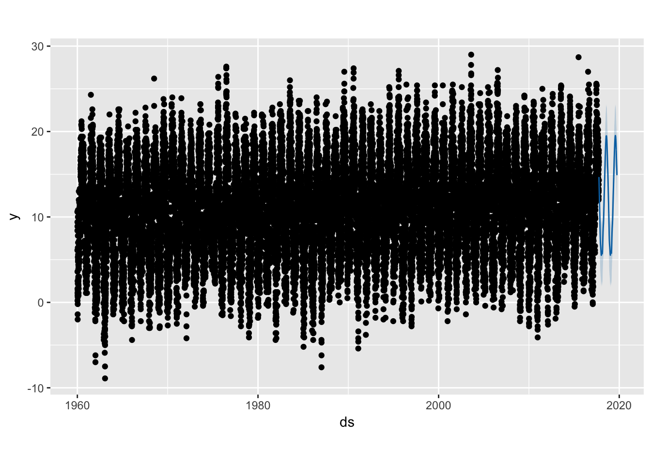
Ehm, yes. As it is the case with most time-series packages, you can get component breakdowns that allows you to identify trends in varying resolutions:
prophet_plot_components(m, forecast)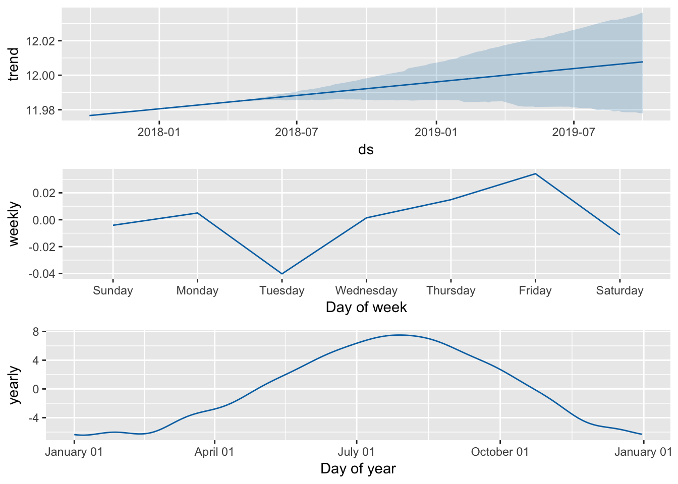
Couple of points. The monthly component looks reasonable, peaking around August. Second, the weekly breakdown gives some support to the notion that the universe teases you until Friday and the weather trend that led up to the weekend is negatively correlated with your enjoyment of the said weekend. On the flip side, Tuesdays are particularly singled-out. I’m open to all kinds of UK-idiosyncratic explanations.
Finally, there is also the option for cross-validation (nice). If you use caret,2 you might be familiar with the forward rolling origin technique, which is a cross-validation method for time-series data. Basically, you designate a chunk to act as the training sample, and identify a horizon value that determines the next testing sample size. Depending on your setup, you can either have a fixed-window (that always moves forward with each fold), or always include the previous chunks (a constantly growing training sample).
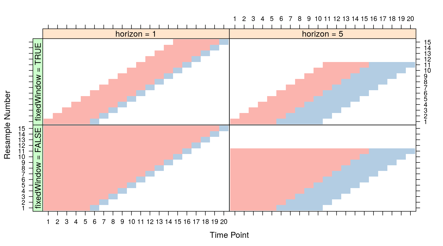
Prophet has a similar function. We can choose the initial window as the first fifty years, and try to forecast the next two years until we run out of data3:
df.cv <- cross_validation(m, initial = 365 * 50, horizon = 365 * 2, units = "days")## Initial log joint probability = -374.442
## Optimization terminated normally:
## Convergence detected: relative gradient magnitude is below tolerance
## Initial log joint probability = -648.25
## Optimization terminated normally:
## Convergence detected: relative gradient magnitude is below tolerance
## Initial log joint probability = -417.741
## Optimization terminated normally:
## Convergence detected: relative gradient magnitude is below tolerance
## Initial log joint probability = -413.471
## Optimization terminated normally:
## Convergence detected: relative gradient magnitude is below tolerance
## Initial log joint probability = -544.74
## Optimization terminated normally:
## Convergence detected: relative gradient magnitude is below tolerance
## Initial log joint probability = -414.229
## Optimization terminated normally:
## Convergence detected: relative gradient magnitude is below tolerancehead(df.cv)## ds y yhat yhat_lower yhat_upper cutoff
## 1 2010-10-03 15.0 14.21399 10.45260 17.78065 2010-10-02
## 2 2010-10-04 14.8 14.10426 10.36684 17.35462 2010-10-02
## 3 2010-10-05 14.7 13.92199 10.24851 17.63122 2010-10-02
## 4 2010-10-06 15.7 13.82956 10.22811 17.57382 2010-10-02
## 5 2010-10-07 13.3 13.70796 10.42333 17.67298 2010-10-02
## 6 2010-10-08 16.9 13.60735 10.17033 16.96441 2010-10-02Let’s start with a crude mean comparison:
t.test(df.cv$y, df.cv$yhat)##
## Welch Two Sample t-test
##
## data: df.cv$y and df.cv$yhat
## t = 3.2735, df = 8629.5, p-value = 0.001067
## alternative hypothesis: true difference in means is not equal to 0
## 95 percent confidence interval:
## 0.1473859 0.5873921
## sample estimates:
## mean of x mean of y
## 11.91995 11.55257OK, not bad. Actually kind of good? Tingling senses? Yes, me too. Let’s look at the actual and the predicted values a bit more in detail:
summary(df.cv$y) #actual values## Min. 1st Qu. Median Mean 3rd Qu. Max.
## -4.10 7.80 11.90 11.92 16.30 28.70summary(df.cv$yhat) #predicted values## Min. 1st Qu. Median Mean 3rd Qu. Max.
## 4.769 6.516 11.236 11.553 16.301 19.287Ah, that’s not good! The curse of predicting extreme values, a common time-series ailment. Sometimes though, a plot in base R is more than a thousand descriptives:
plot(df.cv$y, df.cv$yhat, xlim = c(-5, 30),
     ylim = c(-5, 30), xlab = "Actual Values",
     ylab = "Predicted Values")
abline(a = 0, b = 1)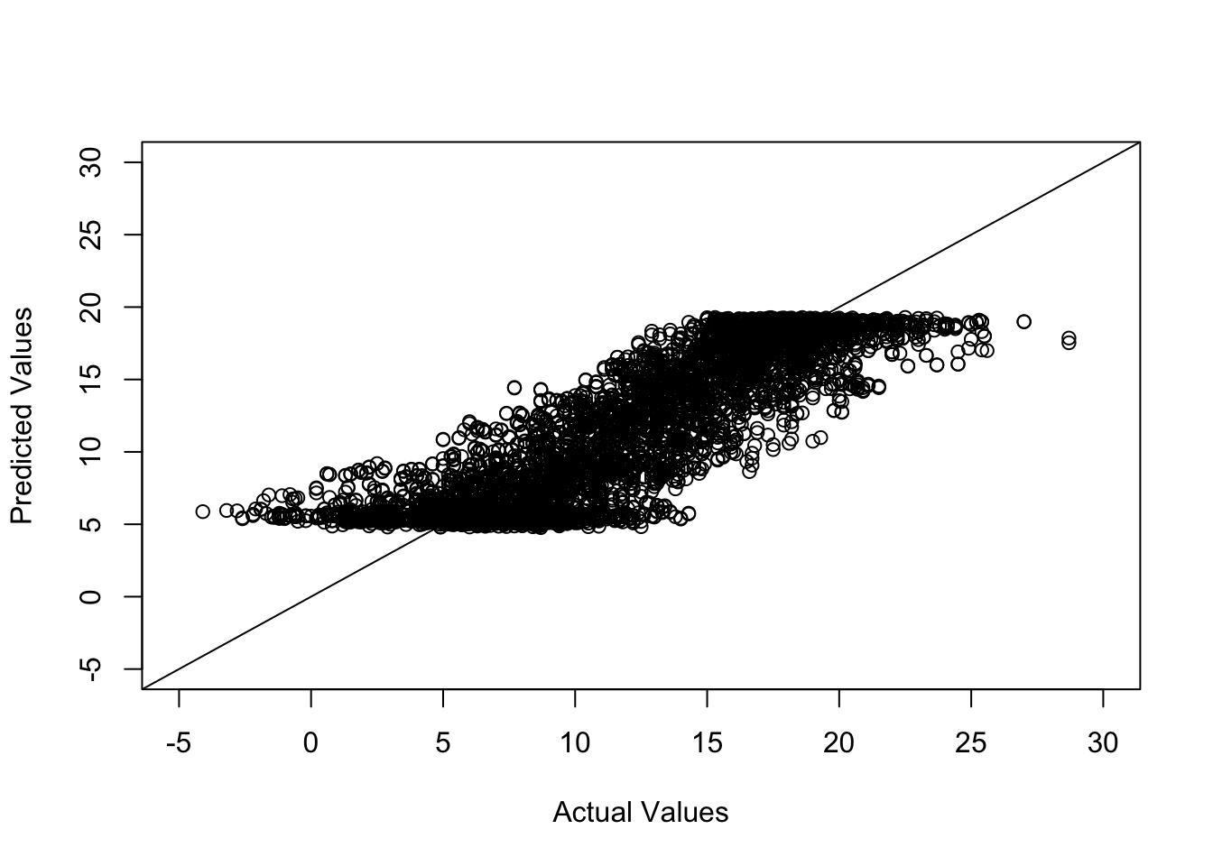
You probably want to squeeze the dots sideways so that they can also be on the edges. On a more serious note, there are a couple of reasons why this happens. First of all, we are predicting the next two years worth of daily data. I know some people make fun of meteorologists, but they are doing an amazing job in terms of forecasting given the hand they are dealt (i.e. probabilistic chaos). If an R package could just automatically give us accurate forecasts up to 2019, there will be certain employment-related consequences.

Second, as alluded in the introduction, there are several factors that can mess up a time-series forecast. Outliers, missing values (although prophet can deal with those), and the frequency of data are the main culprits here. Combining both points, we would probably obtain higher quality forecasts if we try predicting the upcoming week or month. Finally, we are taking this path on purpose, as you would normally build up and test for shorter predictions (and keep pushing the model until it breaks) rather than intentionally trying to break the model and then recover it.
a.better.future <- make_future_dataframe(m, periods = 30,
                                include_history = FALSE)
a.better.forecast <- predict(m, a.better.future)
head(a.better.forecast)
## ds trend seasonal seasonal_lower seasonal_upper seasonalities
## 1 2017-10-01 11.97663 2.702197 2.702197 2.702197 2.702197
## 2 2017-10-02 11.97668 2.594132 2.594132 2.594132 2.594132
## 3 2017-10-03 11.97672 2.429601 2.429601 2.429601 2.429601
## 4 2017-10-04 11.97676 2.350035 2.350035 2.350035 2.350035
## 5 2017-10-05 11.97681 2.240572 2.240572 2.240572 2.240572
## 6 2017-10-06 11.97685 2.135356 2.135356 2.135356 2.135356
## seasonalities_lower seasonalities_upper weekly weekly_lower
## 1 2.702197 2.702197 -0.004120552 -0.004120552
## 2 2.594132 2.594132 0.005020584 0.005020584
## 3 2.429601 2.429601 -0.040232351 -0.040232351
## 4 2.350035 2.350035 0.001408744 0.001408744
## 5 2.240572 2.240572 0.014909518 0.014909518
## 6 2.135356 2.135356 0.034211620 0.034211620
## weekly_upper yearly yearly_lower yearly_upper yhat_lower yhat_upper
## 1 -0.004120552 2.706317 2.706317 2.706317 11.01016 18.39044
## 2 0.005020584 2.589111 2.589111 2.589111 11.00830 18.20630
## 3 -0.040232351 2.469834 2.469834 2.469834 10.89339 18.20116
## 4 0.001408744 2.348626 2.348626 2.348626 10.56261 18.10585
## 5 0.014909518 2.225663 2.225663 2.225663 10.78805 17.92865
## 6 0.034211620 2.101144 2.101144 2.101144 10.39699 17.91505
## trend_lower trend_upper yhat
## 1 11.97663 11.97663 14.67883
## 2 11.97668 11.97668 14.57081
## 3 11.97672 11.97672 14.40632
## 4 11.97676 11.97676 14.32680
## 5 11.97681 11.97681 14.21738
## 6 11.97685 11.97685 14.11220Let me know if those object names are earned or not!
On a closing note, let’s get a single day prediction that would likely fall outside the +4/+16C interval (in real life):
better.days <- make_future_dataframe(m, periods = 120,
                                include_history = FALSE)
best.day <- better.days[better.days$ds == "2018-01-05", ]
best.day <- as.data.frame(best.day) #prophet requires df
best.day$ds <- best.day$best.day #list name becomes column name above
the.forecast <- predict(m, best.day)
the.forecast$yhat
## [1] 5.588844RemindMe! 75 days “check prediction”
P.S. Contrary to popular belief, I am a good namer of objects. I use dots for objects and dashes for functions (in R, obviously). That’s +2 stack overflow style points right there!
Couple of years ago, I referenced one of their published papers in a class I was teaching. This is one of those times when you are social scientist in academia and everyone else has better data. And they put their n in the title. All 61 million of it. It’s an experiment as well. Observational crisis here I come.↩
I am aware that the technique existed before the package. However, I got acquainted with it while working with time-varying covariates in
caret.↩I should note that this is a somewhat ridiculous first test in terms of time coverage. Definitely belongs to the “break the model first, then lower expectations” camp of package testing.↩